

UPDATE September 3, 2024: the new HUD has been released! Read about it in our 1.73 update notes >
The latest “This Season on Zwift” press release came out last week, detailing what’s in store on the platform over the next few months. One game update that Zwifters are happy to see is the HUD refresh, launching this summer!
Below I dig into what I know about the new HUD based on images from Zwift and recent chats with internal contacts, including Jon Mayfield himself.
Key Changes
What are the key changes in the new HUD? I’ve labeled them below:
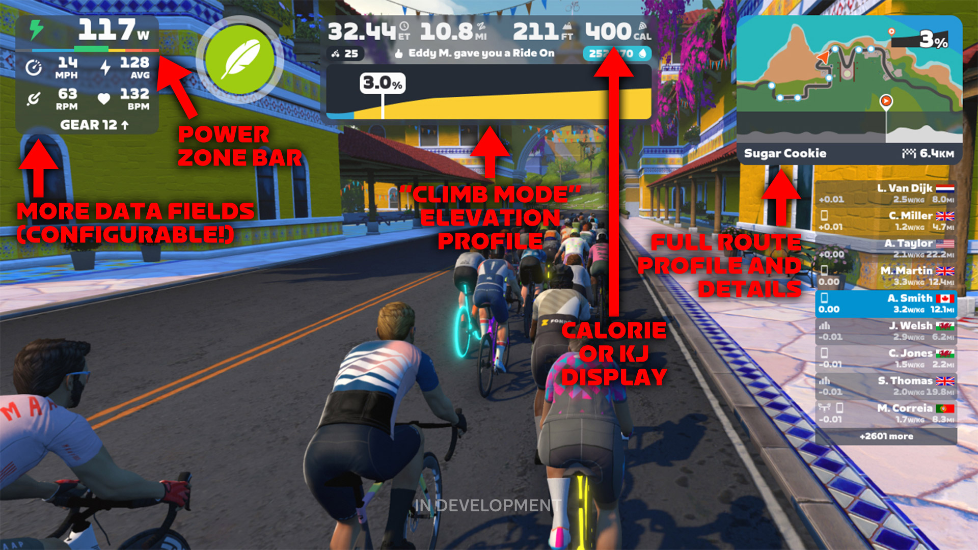
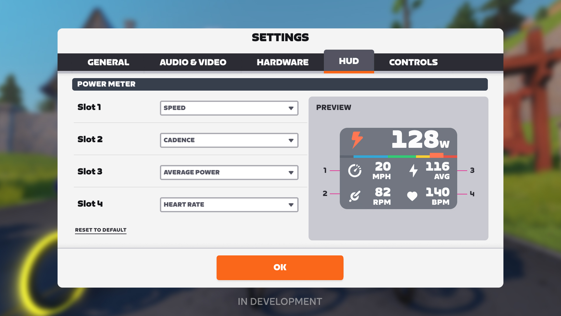
- More Data Fields (Configurable): the “power tile” now has 5 data fields, with the bottom 4 being configurable. Zwift says we will be able to choose from Speed, Average Power, Power-to-Weight Ratio (W/KG), Cadence, and Heart Rate.
- Power Zone Bar: this has been borrowed from the running UI. It’s a dynamic bar showing the current zone you are in, and the width of each zone grows as you spend more time in that zone. Who will be the first to do an entire activity in the red? 😆
- “Climb Mode” Elevation Profile: this element only shows up on climb segments. Gradients are colored using the same scheme as the Climb Portal, and according to Zwift the profile shows you the next kilometer or so of the climb.
- Calories or Kilojoules Display: the current UI only shows calories burned if you click into the Menu screen, but Zwift is putting it in the center HUD. It sounds like this may be configurable as well, so Zwifters can choose between showing calories or kilojoules.
- Full Route Profile and Details: this is a big change! The new profile display shows the entire route, indicates your position on the route, and gives you the distance left to complete the route.
Comparing Old and New
Grab the center bar and slide left or right to compare the current UI (left) with the new UI (right).

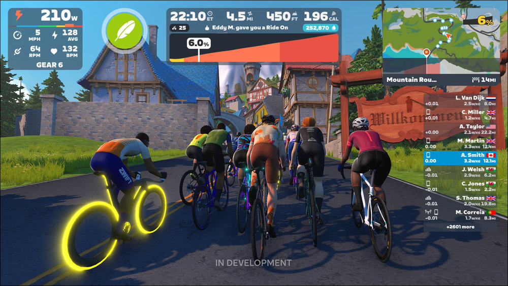
Apart from the new UI elements discussed above, what else do we notice when comparing Zwift’s current UI to what’s coming next?
- The new UI’s elements have a more consistent color scheme.
- The route profile at the bottom of the minimap is significantly larger.
- The 4 metrics in the top-center have been changed. Currently Zwift shows Speed, Distance, Elevation, and Elapsed Time. The new UI shows Elapsed Time, Distance, Elevation, and Calories.
- The route progress bar has been removed from the center element, as has the level progress bar. (Possibly the level progress bar is only hidden when “Climb Mode” is enabled.)
- The rider list is shorter on the new UI, only showing 9 riders vs the current UI’s 13. (Possibly the screenshots for the new UI were taken when there were only 9 riders nearby).
- The orange arrow in the minimap indicating my position is larger in the new UI.
And There Was Much Rejoicing
Updates to Zwift’s HUD have been a long time coming. Apart from adding the route progress bar back in 2021, not much has changed with the HUD since the early days of the game. This update includes some welcome changes, including configurable fields in the power tile, a full route profile view, and the “Climb Mode” view.
From the sound of it, Zwift may make more data fields available after the initial release. Personally, I’ve been spoiled by Sauce for Zwift‘s many options! While Sauce is more complex than Zwift wants to be, I’d love to have the option of some sort of draft meter, a “groups” view for races, and a W’ metric.
Your Thoughts
What do you think of Zwift’s planned UI update? Share below!


It would be nice if they could add a level indicator in the riders list. There is some nice space for it just after the time difference. I just like to know not just where people are from but also their zwift level
If you mean in what Cat then I agree!
When I’m riding with Bernie I’m sure not all riders are like me Cat D.
It would be nice if the heart icon on the left also changed colour to represent heart rate zone.
I’d love to be able to move that climb profile. Being able to put it where the power graph is (bottom of the screen) would be great. I dislike climbing, but like to be able to look up and off into the distance and see what’s coming. Having that big, dark box there looks like a ceiling the obscures that distance view. I appreciate the idea of a more detailed climb graph with colors for gradients, just not right where it is. I know, we’ve been asking for this for years, and now I’m complaining about the location before it even arrives. Not very nice of me. I am glad to see something like this coming, so I don’t mean to sound ungrateful.
I agree, it’s quite intrusive into the main view, especially when the map on the top right shows the full gradient map and % incline anyway. Hopefully we’ll be able to turn items on/off.
I don’t need or want to see calories or kilojoules. That needs to be completely configurable.
+1 it’s only minorly annoying to me but it could be triggering (in the actual medical sense) to users recovering from eating disorders.
Agreed. I won’t even look at this after a ride
It would be great if this field could show TSS. It is definitely the metric which i prefer to look at (vs calories or Kj)
How will the new display handle routes with multiple laps?
These changes are very welcome for me , they simply add an extra dimension like i.e. Sauce.. nice one zwift.
A W’bal gauge and a draft gauge (like in Sauce for Zwift) would be nice and useful options.
I’d also like the course elevation profile (the one below the map) to be color coded, but I’ll likely just continue to use S4Z to achieve that with high resolution 🙂
It’s certainly a big improvement, but I agree that the groups function that Sauce offers is the conspicuous missing part. Maybe they’ll have some form of that for races at some point.
Would like to see the green sprint signs at the roadside on the minimap
An improvement; but the mini map needs to show the sprint/kom/finish banner locations. Plus I would much prefer they swapped the calorie count with a draft percentage figure.
It looks like they are now color coded green and red on the elevation profile which is great! Though I agree it would be nice if they were visible on the mini map and the companion app map.
Looking to the last updates I don’t expect much from Zwift anymore. Still no chance to hide the kom results or fellow zwifters panel, but even more cluttering in the screen.Climb mode and calories, my ass. Just the mini-map is a minor improvement.
I would like to see average speed of the current ride rather that waiting to see it in Garmin Connect at the end. As a former east bay resident, my riding area averaged 500- 1000 ft. of climbing for every ten miles. It was the hardest part of riding getting back on the bike late in life. Now, I just figure it is all part of the ride, so I like the quick look at the elevation profile.
Mt. Diablo was almost in my back yard–figuratively speaking. You had to entrances:
North Gate:
https://www.strava.com/segments/%D0%94-mt-diablo-north-gate-to-summit-7967598
South gate:
https://www.strava.com/segments/609257
Overall I think it’s quite a nice upgrade. Is there no longer a route progress bar or distance to finish info available now, or is that just hidden when the climb mode elevation profile is displayed? I like to know that information as I distract myself/negotiate with myself while I ride.
Distance to finish on the right, below the route profile. Route progress bar is also there, overlayed in the route.
nice, thanks.
May not be a finished product but definitely improvements over the current (stale) HUD.
Why make the watt # smaller? Seems like I would want the opposite.
Hey Eric, were you aware and/or planning to cover that Zwift stealthily abolished child accounts for U16 Riders about a month ago?
I knew they had been making changes to that and discussing how to communicate it for the past several months, yes. I plan to write a post once I get a clarity about what’s going on.
Thanks Eric, much appreciated. Anything you can find out or any visibility you could add to this would really help. As far as I can see there are two sides to this:
1. they are disbanding the programme which gives U16 free access to Zwift which is something which is sad but which I can to some degree understand. It causes extra admin for them, the added liability of safeguading minors for zero return. It did however show really strong support for the next generation of riders.
2. They are completely removing further U16 riders from the platform, paid or unpaid (existing accounts seem to stay active … not totally clear what happens when the current free 1-year subscription runs out). This one I cannot understand. I would have understood it if they had added family subscription and given the paying account the admin rights to lock down the account as much as they see fit … but just saying that future potential paying customer are unimportant to the Zwift business model seems very strange.
My kids have ridden thousands of km on Zwift. My 9 year old son is level 44, has ridden AdZ in 53min and races competitively in Cat C. I will be a bit irritated if I now have to pay $300 more a year to keep them on, but the thought that they’d keep people like them off the platform is totally absurd. I’ve personally ridden 57000km but if that’s the plan, our family of 4 will all leave the Zwift forever, full stop.
Hey Andy, I fully understand your predicament but would suggest to not jump the gun and wait to see what Eric and DC Rainmaker can find out (who I contacted separately). Communication has been abysmal. Apparently it started with the online form simply being “broken”. After several support requests they eventually changed the site to the current message that any further U16s would not be allowed on the platform anymore. If there was an immediate plan to remedy this with, e.g. family subscriptions I’d be all for it but there would at least need to be some communication which people can base educated decisions on.
Interesting. I didn’t know the part about the form being broken. I will say their emailed response does not sound encouraging or like they are in the process of developing a solution – “we hope that kids can find alternative ways to continue pursuing the joys of riding a bike.” Hopefully it is just a case of pretty bad communication. All they would have needed to do was say they were “temporarily” unable to add U16s. Either way it sounds as though my kids can continue. Leaving Zwift would be a last resort for me but one I would eventually consider if they will not allow further U16s like my kids’ teammates to join. For now I’ll try to raise awareness and apply whatever pressure an inconsequential guy like me can.
That was exactly my thinking. Hence the attempt to get Eric and DC Rainmaker to cover this topic to bring this out into the open and to have someone talk about it who has got a voice. At the very least it would hopefully result in some kind of communication from Zwift that will hopefully answer some of the many questions that are out there right now. At best, if the outcry is loud enough (I don’t expect it to be), there might even be some kind of partial U-Turn. We shall see
Unfortunately Ray’s thinking on this is not encouraging. I had contacted him last night – I had no idea he was already writing something about it. He appears to think they may remove all U16 accounts.
Would be great to be able to change the size of the HUD-fields. For us watching big screens the HUD is huge and concealing.
Technically its only two configurable fields since no one is going to turn off their Heart Rate or Cadence metrics.
Also, I wonder what’ll happen to the new elevation chart on the right when you do a u-turn.
Speak for yourself! Heart rate monitors are entirely optional. I’ve never found the need to purchase one.
It is a nice start of hopefully more to come. But not enough data fields and indeed missing the draft and goup functions S4Z has is a bit of a let down.
I wanted to put the watts in the center like workout mode.
average is good but only if I can reset it.
It would be awesome to see my average cadence, average w/kg, or 20min/5min/1min/30sec/15sec w/kg as a configurable value. Could be useful to people doing training sessions. And I’m thinking 4 configurable slots isn’t enough. 6 would be much more useful.
Huge improvement! My only suggestion is to include draft numbers as an option for either the Power Tile or Power Zone Bar.
I welcome the HUD changes if they’re actually the first steps towards a much bigger overhaul of the HUD. If these get released and then Zwift doesn’t continue to develop it further (which they’ve been guilty of a number of times) then it’ll be disappointing.
As a racer, I would love a group time difference indicator a la indievelo. Currently, I have to be at the front of the pack to see how much of a time gap the breakaway has, or be at the back to see how far back the chasers are.
If you only gave me one metric I would want it to be speed. So I’m fairly meh that it’s been moved and is now less prominent.
As a visually impaired Zwifter i am concerned that some of these changes are going to make Zwift less accessible. A lot of the fields appear to have reduced in size. When i saw the HUD redesign announcement, I was hoping for a lot more customisation. Being able to drag different components to increase their size would be awesome.
Absolutely dope remake. The only thing missing for me is the configurable FRC/W’bal indicator for racing.
Did I miss the rider position in the new HUD?
Welcome these. But I’d like they will put something in the no-hud, for example a little display of speed and watts and hr. No-hud is beautiful because it allows you to enjoy the scenery but ithout this data it’s not viable
If I feel like soaking up the scenery I run No-HUD paired with the companion app. Works for me. 👍
Don’t want to hate but really feel the updated top left is doing a big disservice to riders doing intervals/workouts at high intensity.
Right now it shows me the only 3 numbers that matter while working hard: watts, RPM, heart rate. I can already tell I won’t be able to read the new watts number on my iPad screen without glasses which makes it basically unusable to me.
Happy to see they’re trying to improve the HUD but at the end of the day I’m certainly not the only rider who doesn’t need to see all that info at all times but likes to focus on the important stuff instead.
Climb bar in the center takes off too much real estate but I can live with that.
I, and I’m sure many other users on tablets and laptops, have the same concern at shrinking fonts. The new design will render the ‘Power Tile’ unusable without glasses (and leaning nearer to the screen to use said glasses).
The unifying of colours AND 2×2 vs 1×1 grid under shrunken Watts) are concerns too. It may look aesthetically pleasing, but the existing differing colours hugely aid the HUD’s use.
I often like to time trial routes. It seems the most similar to how I ride outside. I like the average power, but would also like average speed on a route. That way I could more easily play with the game physics and test for myself how different approaches affect the speed, like applying more power uphill than downhill etc. Having to wait to see the route times till after the ride would make this less easy and less fun.
I suspect we are looking at UI mockups of what they are aiming for and not actual screenshots in-game of the in-progress work. (Eddy M is giving kudos in both screenshots and number of drops is identical in both screenshots but distance is over 5 miles different, unlikely these are screenshots.) So I’m not going to look at and compare every minor detail as the final product will probably differ from what we see right now.
When I used to play world of Warcraft 20 years ago you could either design your own UI or download an addon that would allow you to modify it yourself. But the key there is you could basically access any data and display in any way you wanted… With Zwift it’s shocking that I can’t add all my sensors (left/right power or any other field you’d expect from Garmin) and I can’t do basic transformations (e.g. avg 3/10/30s or lap power).
Nice improvement but still some important things are missing:
Yay this should stop all the people complaing about the HUD, Never was a big issue for me personally but i must admit this does look much nicer!👌
I’m not a fan of having the speed removed from the centre HUD to the power tile, and having the calories in this central location instead – IMHO this is a complete fantasy/gimmick value derived from some average kind of metabolism. Why not have all 8/9 values slots on screen configurable, if possible also per use case – workout/race/free ride – where I might be interested in different stats.
Will my kickr bike now show up on his for gear?
I appreciate Zwift, making improvements, I love the individual user being able to configure the HUD how they see fit. I hope I can turn off the random names and ride in thumbs that have no relevance to me and I only obscure my view…. please don’t tell me too turn off the HUD completely
Configurable HR and power zones have been wanted from day 1, They better get their finger out building whole new route expansions instead of a few miles of tarmac here and there, and do other things that zwifters really want instead of wasting 100’s of millions on sponsorships and failed projects, get staffed back up and build more routes, have climb portals with real graphics instead of the cheap 1970’s Atari graphics rubbish to save money.
The possibility to remove the rider list is missing.
Speed off to the side as a minor stat??? That’s pretty garbage. Does anyone in their staff even ride?
is anyone else starting to get tired of these half baked changes (like experience) that require never ending changes cause they can’t get them right?
Guess these things are the reason the price is going up. Awesome job!🙄
Power Zone Bar and Average Power are must have, looking forward to get them
I’ve always wished for two changes: 1) A customizable personal look, where you can simply check or uncheck boxes to items you want on your own screen, and 2) a variable monthly rate where you buy kilometers, like you do with a pre-paid mobile data package for your phone
Not strictly tied to the on-screen UI changes, but I’d quite like to see some of these updates also get applied to the companion app as well. The fact it doesn’t show current gradient (or even overlay the current route onto the map) makes it a lot harder for me to ride in HUDless mode. I don’t want to do it all the time, but it would definitely be nice to make that more viable, especially on new maps/routes.
I like the new layout. Wonder what happens when you’re in range of a pacer bot though? At the moment, the bot drop count bar inserts itself even you’re being overtaken (in my case anyway!). Be good to have that presented a different way as I’m not that bothered about my drop multiplier.
TSS instead of calories/kj?
Lap button plz.
An option to auto give a ride-on when someone gives you one.
I have been waiting for this for a few years, blasting my thoughts about this very issue over on Shane Millers YouTube channel. Unfortunately, ZWIFT is proving to be really hard headed. It would make so much more sense to put any upcoming climbing data at the bottom of the screen mich like another platform already does. Not only would it be more aesthetically appealing, but would use screen landscape more efficiently. This looks like a complete cluster jam. Don’t get me wrong, I really appreciate the larger minimap (which was absolutely the worst part of the old set up, a complete waste of screen space IMO), and I like what they did with the Power Tile, but why would they remove the level indicator and your progress along that line? Why? I have no idea, I just know that I liked it being there. It was a motivating piece of data I appreciated. There’s just too many things going on with ZWIFT. They seem to be their own worst enemy and they are DRIVING PEOPLE TO CHECK OUT OTHER PLATFORMS when otherwise they would have just gone with the flow of thing’s. I have loved being on this platform but I think its time to rewatch Shanes video on how to pause and restart this thingy. I will continue to be faithful to the run platform aspect which seems to be a mere side show to them. No changes announced there as far as I can tell. Anyways, love this page and the opportunity to “Express Myself” as if anybody really cared!😂😂
Thanks!
No mention of it, but assuming the HR line and Power Zone scrolling along the bottom of the screen will still be available if you want it displayed?
Reading all the comments makes it clear to me that there are as many optimal HUD setups as there are Zwifters. Therefore Zwift should consider adopting a highly configurable option, as per Sauce for Zwift, where each Zwifter can select what data he wants and where he/she wants it on the screen. Additionally, Zwifter should be able to save a few configurations (eg. Racing, Group Rides, TTT, Workout etc).
I’d like to be able to disable the hud entirely and still be able to use the app to see other players to give ride on’s and what not. For some reason a disabled hud messes up the app.
it’s be nice to add DRAFT as well to to some option or some RACE SPECIFIC UI …