

Zwift version 1.73 begins its phased rollout today. This is major update that includes the much-anticipated new HUD plus some new routes and Challenges. See details below…
HUD Update
The HUD update is here! It features a front-and-center profile of any upcoming climbs, configurable fields in the left HUD element, and more. See if you can spot the differences (old HUD on the left, new on the right):


The left HUD has four configurable data slots, with seven fields to choose from. Zwift says more fields may be added in the future…
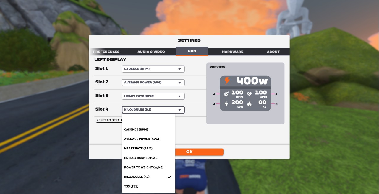
The seven starting fields are probably the most high-requested ones. But what additional fields would we like to see? Here are some ideas:
- Draft meter (watts or percentage)
- Normalized Power
- W’
- Riders passed (for chase challenges)
- Left/Right Balance (when dual-sided power meter is paired)
- Lap stats (Zwift would need to add a lap button)
That left element also includes a power zone distribution bar which shows how much time you’ve spent in each zone during your activity. So on a recovery ride you’ll see a lot of grey and blue, while in a race you’ll see a lot of yellows, oranges, and reds!
The most obvious addition to the HUD is what Zwift calls a “dynamic elevation display”:
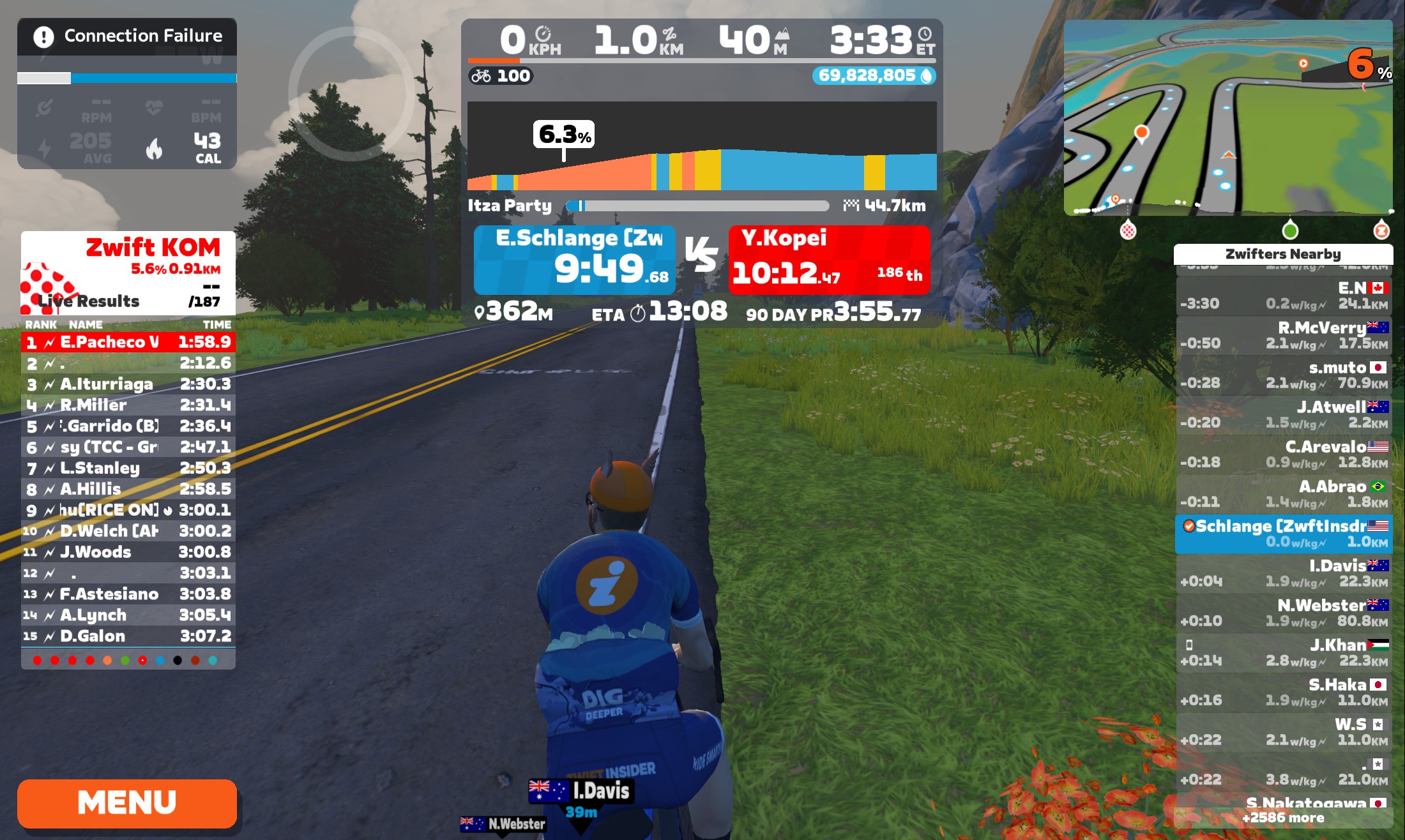
Zwift says, “Any time there’s climbing in your future Zwift will automatically display a zoomed-in elevation display showing the next 800 meters of road gradient.” Nice!
There is just one HUD element we saw in the original previews of the new HUD that isn’t included in this update: it’s the full route profile and details in the right HUD beneath the minimap. Zwift tells us this is still in the works and will be released in the next few weeks – it just needs a bit more polish.
Here’s a quick video walkthrough of the new HUD:
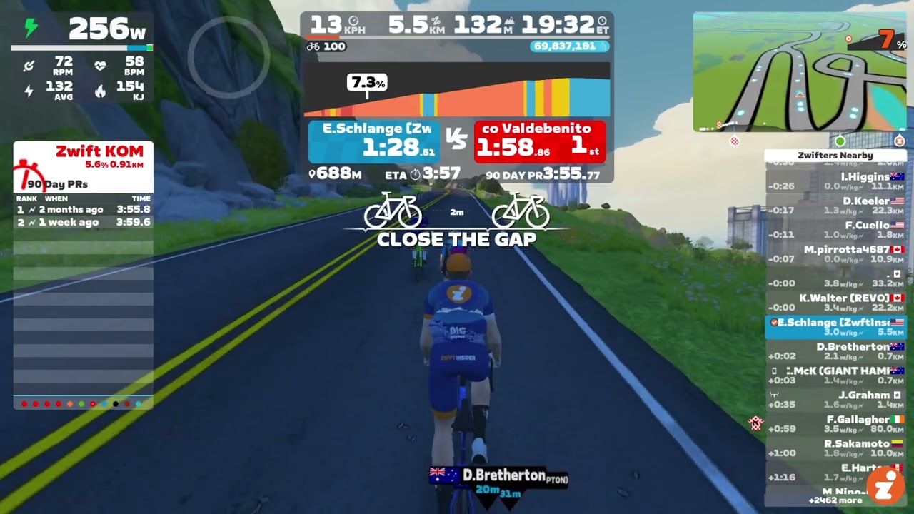
If you’d like to take a longer look at the new HUD in action, here’s a complete recording of a race with the new HUD.
New Routes and Badges
Five routes are now available for free rides and events. They each have achievement badges attached, meaning you’ll get an XP bonus the first time you complete the route:
- Radio Rendezvous: 20.5km, 736m elevation
- Power to the Tower: 45.2km, 1495 elevation (this route features in the final race of Zwift World Series)
- Navig8: 63.9km, 417m elevation
- Mayan 8: 23.1km, 241m elevation
- Makuri Pretzel: 78.7km, 620m elevation
Additionally, Zwift added three new route achievement badges for routes that will be ridden in the Zwift World Series:
New Challenges
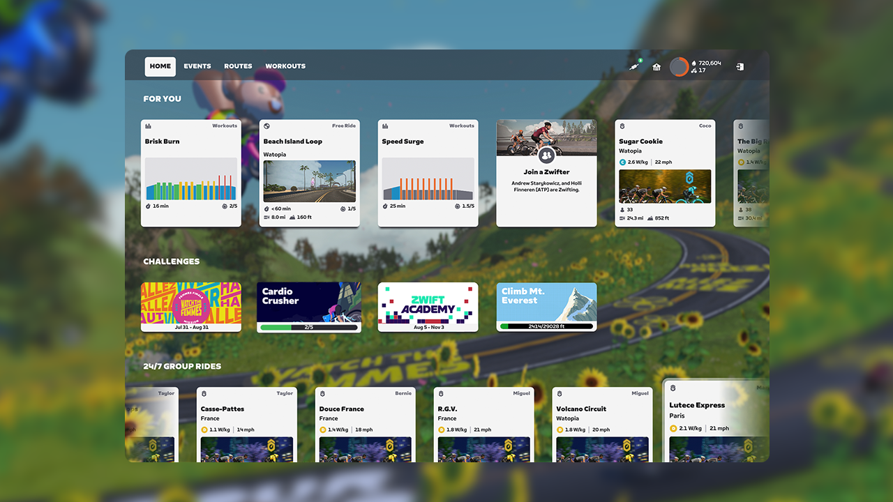
The game has had three Challenges since early days: Tour Italy, Ride California, and of course Climb Mt Everest, aka “the Tron challenge.” (Word within Zwift is that a fourth Challenge is finally on the way!)
But today’s update includes a new type of Challenge. Think of these as sort of mini Challenges that can be accomplished alongside whatever “big” Challenge of the three listed above you have active.
The first challenge, Cardio Crusher, requires you to complete 5 pre-packaged workouts in order to complete the Challenge and get an XP bonus. This Challenge will be available starting September 9:
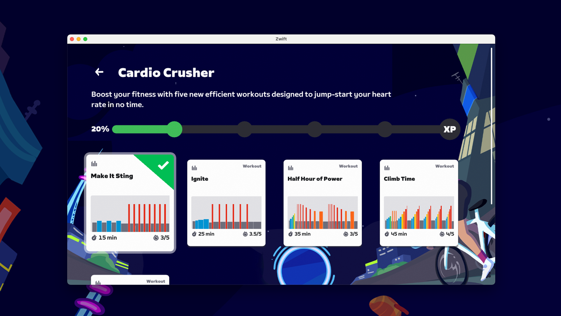
It’s unclear whether these new Challenges will be time-limited in some way, and what sort of XP bonus we’ll get for completing them. But we’re sure the details will be clarified soon.
More Release Notes
Zwift provided notes on additional tweaks and bug fixes in this update:
- Introduced an improved experience for browsing Training Plans in the home screen.
- Fixed an issue that could cause some of the forest to disappear and reappear on the Suki’s Playground route in Makuri Islands.
- Fixed an issue that could cause some roadways to flicker in New York and Watopia.
- Fixed grass appearing on the roadway on the Quatch Quest route in Watopia.
- Fixed some flickering rocks on the Spirit Forest route in Makuri Islands.
- Fixed an issue where avatar hair could be visible through the Alpine hat.
- Fixed a missing roadside sector marker on the Alpe du Zwift in Watopia.
Discuss this update in Zwift’s forum >
Questions or Comments?
If you spotted any other changes or bugs in the update, please comment below!

Looks like the automatic “elevation display” element is going to be a nightmare for people using Sauce, do you know if that can be turned off? Otherwise all this update has done is made the existing HUD a lot WORSE for people who had gone elsewhere for a worthwhile layout that gives genuinely useful additional info such as Draft, full Profile, Segments, Groups info, W’bal, Wkg PBs etc…none of which are in this “updated HUD”
Just turn the HUD off and continue using Sauce, then
Unfortunately Zwift also turns off access to power-ups when you turn off the HUD because they STILL haven’t figured out that individually turning on/off parts of the HUD would actually be one of the best updates and far better than anything they’ve done so far
Rude of them to not consider riders breaking ToS when doing this.
Zwift are well aware of sauce usage and don’t have an issue with it currently.
I’ve had error messages popping up about multiple (2) accounts being logged in at the same time. Zwift shuts down the ‘watching’ account. A squeeze might be starting on Sauce.
It seems like there is an assumption that sauce must remain constant. I think it won’t take too long for sauce to be updated to work with the new HUD.
What zwift posted to github about the encryption of network traffic suggested they didn’t have a big problem with 3rd party tools. Albeit (a) this was some random engineer rather than their legal department posting, and (b) yes, the wording of their terms and conditions don’t help or encourage it – I certainly wouldn’t want to start fixing flaws with zwift and then find they decide you’ve broken T&C.
Specifically, of course, the problem with Sauce is they are asking for a monthly fee, but they can’t provide any guarantee that their software will work because they aren’t in control of zwift.
Bottom line, I think like this, if I was the boss of a company and I had a big room of fat, overpaid IT workers browsing reddit or whatever, then I would go downstairs and shout at them to improve the software, I wouldn’t stop a stranger in the street and start paying him to fix stuff – we’re already paying a monthly or yearly subscription that funds a development team – so why do we need to pay another one? We should be politely insistent that they improve zwift – the investors should be demanding more for their investment.
We might not be the boss in this hypothetical, but we’re certainly already paying for software developers. If Sauce was some doing some niche thing, or a complex thing, fair enough, but it’s not – and there’s no reason we should pay twice and still end up with something that’s not particularly good – you know if Sauce were free then sure, having to run 2 accounts blah blah blah and “might break” would be fine, but it’s not the experience I’d want in a paid product.
2 different broken hud systems and you pay 2 different people for them? That’s not really a solution. Kudos to Sauce’s developer though for showing that a customisable hud is not something that requires a large development team or millions in investment.
I’m quite sure you can still use power-ups through the Companion App. when the Hud is turned off. So, not an issue for most. But. I agree it would be great to be able to turn on/ff parts of the HUD as on some other platforms.
Luckily you can just use Sauce and turn the Zwift HUD off completely…works for me.
Can the elevation hud be turned on and off? Obviously I haven’t seen it yet but it seems to take up a very large amount of real estate on the screen blocking a lot of the scenery.
The customisable HUD is great though.
I’d love to be able to move that to the bottom (where the effort graph is). With that effort bar now part of the upper left HUD, that’s probably enough detail for me and I’d prefer seeing the elevation down low where I don’t lose visual information.
Oh great, now when I’m climbing I can see even less of the Zwift roads and that’s before you add in power ups and coffee stop symbols. Who thought that was a good idea?
man, there’s no pleasing some
There’s plenty on Zwift that pleases me but the UI is a disaster. Over 10 years they’ve continued to add more and more clutter to it with only an all-or-nothing option. The ability to turn on and off the various elements of the UI is years over due.
Well you know restaurants figured that the best way to please most customers was to give them choices rather than making everyone eat the same meal.
And this isn’t something new that people have just mentioned after an update. There are 10 years of posts about the zwift UI – showing that even if that decade of feedback didn’t make it clear what the UI should be like they should have deduced that it was broken.
And a bad restaurant can be one that tries to give too many choices, spreads itself thin, and rather than have a hand full of signature dishes, has a smorgasbord or unpalatable food.
Yes there is. Simply offer the possibility to switch it off. What’s the sense of landscape when I can’t see it because the is clutter everywhere on the screen.
FFS, it’s a virtual indoor training platform. You want to take the scenic route, then get Rouvy or FulGaz. Or even try this for realism, and uncluttered displays – ride outside.
You probably have a Nintendo Switch and complain that Super Mario Karts isn’t as realistic as F1 2026.
Just use the hide HUD feature if you want the full immersive experience.
That’s what he’s saying, it’s all or nothing that’s the problem.
I agree that there’s too much clutter now.
A HUD is needed for most of us, but to keep adding to it, with no option to choose what is shown is getting silly. They’ve given the option for the top left window now, but it should be possible to select the various parts to show.
I don’t think the all or nothing works.
Specifically too because the dashboard on companion isn’t configurable either. Otherwise, yeah, companion near stem showing data I want to see and just the display would be how I would use it.
That would give me an issue that I need 2 different pairs of glasses for that, but that’s a me problem I can solve – all I’d ask of zwift is that they create a configurable UI because, like them I don’t know what you like, but I do know what I like.
Occasionally though I might want to ride in a group and see the other rider data – but the rider data I want to see isn’t a name in a big font, a big flag and then lots of smaller stuff. It’s the smaller stuff I’d want to read.
Many of us do
If HR and power would still be visible I would do that gladly…
It would be so much better if you could move that to the bottom rather than the top. That way, I can look ahead and see what’s coming or just look up.
Looks like very little changed. I wish there was an option for a minimal UI, or let us pick what to show and hide.
Thank you Zwift!!! A really nice upgrade. Kudos to all concerned.
I excitedly logged into zwift a few minutes ago, UPDATE !!! Err no just a minor bug fix ! 😟
Awesome
The new HUD is great. A real improvement in the Zwift experience. Now, how about the storage shed. I’d really love to thin the garage of bikes, wheels and kit I NEVER use.
Agree. Plus, the pre-config bikes would be a real plus: I don’t usually switch wheels and frames on my build (though sometimes I do) in real life, so how about having three presets with a frame/wheels combo that you can select, like choosing which bike you want to use when you get into the garage?
Can Zwift read L/R balance from a Tacx Neo?
I really wish Zwift UI/UX team would give us the ability to remove elements of the HUD, instead of their current “all or nothing” approach. Current setup is to use ZCA in Dashboard mode, and Sauce, so I can actually see the data I want as well as enjoy the scenery.
will the new elevation display show the road which we are actually on, or will it be like the old (current) display which shows a random climb in the area which isn’t necessarily the route that you are currently following…?
if they’ve fixed that, it will be a very positive step
Today I did the REVO subv2 ride at 5 am in Arizona and it looked much different. At the beginning you could not see all the other rider in the chute like you usually do before it starts. Then when it started there were riders and the comments from the ride leader fit but I just basically rode by myself for an hour. I actually exited and joined the ride twice before it started because I had enough time. I had used the phone app to select the ride from the events section. I have ridden a lit of miles on ZWIFT and it had never been like this.
Are you sure about this part? I rode a few different words today and the elevation on the bottom line of my minmap was the route profile not the “section” I was on. This is a change. Is there more elevation profile changes coming or did they accidently release it now?
“There is just one HUD element we saw in the original previews of the new HUD that isn’t included in this update: it’s the full route profile and details in the right HUD beneath the minimap. Zwift tells us this is still in the works and will be released in the next few weeks – it just needs a bit more polish.”
There are a few routes where the section is the route. Watopia Hilly Loop, Sand and Sequoias, both Paris loops. I think also Makuri Farmland Loop and Richmond UCI Worlds. There’d be a few more too
Yeah, I noticed it seemed to have changed somewhat down there… but I don’t think the changes there are completed, either.
One reason I enjoy the portal climbs is knowing the color codes , nice to have that on the main screen for the other courses and their climbs . Oh one thing Eric , any chance to have speed at 19.1 -19.2 and so on , reminds me of my first Cateye computer in 1986 when it was 18.0 then 19.0 . I know todays riders use power . I do as well . But would be nice to have Zwift like my Garmin 5300 . Thanks for the work you put in . Zwift since Dec 2023
Not sure about other trainers but my Zwift Hub no longer has race mode since this update.
That’s not a Bugdate that’s a Zweature now
I noticed this too. I think it’s more of a HUD issue. If you go to the pairing screen while you’re pedaling, you’ll see your watts changing like they normally would. I suspect the HUD is only updating at 1Hz. But I could be wrong!
Well when I sprint there’s a delay of a second or two in the avatars reaction, so I’m guessing I’m in 1hz mode. With the Zwift Hub there’s no way to manually set it to race mode unlike the Kickr where you can set it in the Wahoo app. I got a message back from Zwift hq on the forums and they are aware it’s an issue for some people, and plan on fixing it for the next update.
hmm your right, it acts normally in the pairing screen for me too just not in game hud
As a software engineer I can tell that their codebase is absolutely fucked giving the time and it takes for them to roll out these underwhelming updates. I wonder if they are going to acquire another platform like IndieVelo in the future.
Code = Spaghetti bowl
I remember people mentioning this years ago. The trouble is they’ve kept working on it to the point they can’t go backwards and just have to plough on with it. I bet there’s many things that we’re asking for that could be achieved pretty easily had they written a better base to start with.
They’re probably waiting until Copilot is ready to fix the codebase with a fraction of man-days it would take right now.
It’s been years since they first acknowledged that their legacy code is making things difficult.
The issue at hand is whether, in five years, it will be feasible to find programmers who are both skilled and willing to engage with that legacy code.
Let’s hope not… They’d only screw with it
CAN i see the average speed on the New hub
Can you hide the VS portion of the climbing HUD? I like everything else but that VS portion makes it hang so low and really blocks the road in front of you and most of the time I don’t really care how I compare with random people on the climb.
Eric, is there a universe in which Zwift opens to third party providers like Sauce for Zwift in some way? While I appreciate the effort and intent, I don’t understand why they put so much effort into aspects of the interface that others already do better.
Ex-Fuckin’-Zackly! There are features people have been raging about for years (CE/ZRS, storage shed…) and instead they continually rearrange the deck chairs. Come on Zwift…
Nice
The climbing thing looks a reasonable improvement although I’ve no update to have tried it. Precisely my issue having not explored vastly in zwift was when the grade starting going up 3, 4, 5% not knowing if this was going to be something I could quickly use a big effort to push or if I had to sit up and get ready for a longer climbing stint. Now I use virtual gearing that’s not too bad because you can change gear whenever. When I had real gearing and tried 100% trainer difficulty, it was a real pain when the gradient rose unexpectedly.
Glancing at your pictures the first thing that strikes me is that the biggest faults with the UI remain. There doesn’t appear to be anyone with UI design skills hired at zwift who has given them the (long) list of foobars and faults. It’s like the ‘programmer art’ version of a UI.
I don’t pretend to have UI design skill either, but some of the flaws here are so egregious that you don’t need to in order to see them.
The biggest culprit that anyone can see is that zwift puts unimportant information in a larger bolder font and the more key information underneath in smaller and smaller letters. You know, no one cares the riders around them name and country flag more than they care about their pace and distance away do they? And, perhaps some people have a big enough screen close enough to them that it doesn’t matter, but a lot of users won’t.
Which brings us to the second biggest flaw is that the game works or claims to work on a variety of devices but little effort appears to have gone into making the UI work well with them all. At the extreme, for phones this is especially egregious since phones pretty much for the past 2 decades (precisely because they have a smaller display) have contained a variety of features and UI design to let people make small text and images bigger, which zwift has disabled or not used at all. The end result is, unfortunately, most of the user base has routed around the damage and they don’t use these devices and they’re slowly bitrotting.
I get that we’re probably not wanting to zoom in whilst riding along, but for the few miserable zwift sessions I had using my phone I couldn’t even read the route selection screen to pick a route, pacer ride or event.
The companion app has useful utility for wifi connecting our devices, but the only way I can put my phone on my bars is horizontally which means I can’t read that easily. Why is it vertical only? Especially things like the dashboard. I can’t see it very well but I thought I would hide the hud and use the dashboard but it doesn’t have gear information?
Secondly when I’m riding along looking at the screen in first or third person it makes no sense for me to have to keep looking up to the top left to see my data. I ideally want my data just below the centre of the screen where I’m looking at my character (or, in first person, at the road) Nor does it make much sense that my data is in variety of different font sizes.
Ok with this one you might have a reasonable argument that power data is more important than the others, but it’s a struggle to read the other data on many displays. If you work at zwift and own a garmin or wahoo computer, take it out now and look at the options to configure the data screens. They let you pick how big stuff is right, what you see and where it is. Look at the size of these devices, smaller than a phone, yet millions of cyclists have them on their stem reading the data on them. Look at the size of the garmin device that has a map, it’s a tiny display relative to a phone – yet it works. zwift UI is terribly broken by comparison – I need a huge display (relatively speaking) to be able to read it well – and ok, I get that zwift is displaying a picture of the road and other cyclists that my garmin doesn’t, but, by and large it’s not the display of the 3d that is broken – when I used my phone I could see myself riding along reasonably well. I just could barely see my wattage and practically see nothing else.
And, now I’ve switched to a laptop it’s only marginally better there are still UI elements that are not readable at the same time as other elements, that I have really no need to read are large and cartoon like.
And the same is true whether you’re riding or selecting somewhere to ride, UI elements are oversized while others – containing pertinent information like the w/kg of the robopacer, the amount of climbing or the distance are much smaller than need be.
The zwift guys need to sit down and decide whether they are developing code for a variety of devices which will be at a variety of distances from the rider or if they’ve given up on that and are just going to support a large TV close to the rider. Pick one or the other, tell everyone and then commit to that. If it’s “support lots of devices and screen sizes” you’ll have some work to do.
Each of those riders will want to read the information. You can’t just create a UI that’s great if you have a 55″ or larger TV close to you. That’s the first problem to solve.
The second problem is to let users put the screen elements where they want to see them – I want to see my gear, wattage etc right underneath the centre, as I said above, so I can look where my virtual self is riding and see it without having to look around the screen.
Next, a choice of ‘Show everything or nothing’ is too coarse grained, we should be able to switch on and off the hud elements we want to see. Ultimately we should be able to define a set of custom huds with our choices of panels and UI elements / data on each and cycle through them (just like you can on a garmin cycle computer)
Zwift community could then create huds and share them. Zwift isn’t good at hud design or fast at software development, so I’d suggest outsourcing this one to the community, create only a default hud and whatever the community needs to create huds and share them, add the functionality to cycle through huds and then sit back and watch the community design the UI for you.
(This is true of route creation too, give the community the tools to create routes – most of the poor design decisions in zwift are on the false premise that “zwift is social”, e.g the fact we can’t choose to ride in whatever world we want. This is supposedly so the worlds don’t feel empty, but it’s just terrible design forcing people to do something they don’t want to do – clearly building routes by hand is both expensive and slow and the obvious thing to do is to let other people do that who you don’t have to pay)
(If a game is social that means you add features that let people group together and then the people who want group rides can easily find and join each other. It shouldn’t mean when you’re going for a pizza by yourself you force a bunch of strangers to go to the same restaurant by closing all the others so you don’t feel lonely – that mentality is sociopathic not social)
Similarly, in UI terms, there’s far too much space given up to strangers – as I’ve already said, usually with the most pointless piece of information about the stranger made bolder and bigger and the key data small. If I am looking at the UI to see a leaderboard, I want to see the times at least as prominently, if not moreso, than who set the time. And similarly for who is riding around near me, if they are speeding up or I want to see how far ahead I have to squint to see that, but their name is bigger and bolder? And these take up so much space on the display. Fine if you have a big display, but it’s wasted space for someone on a smaller display who primarily needs to see their own data – perhaps the solution for a small phone is only seeing your own data – but right now you can’t do that, it’s all or nothing – and when the text is so small that actually means it’s nothing or nothing.
The bottom line is : zwift needs a highly skilled UI designer or three to work on it – but, as I said, giving the hud over to the community might be the cheaper and easier option. You’ll note many FPS games have a variety of community designed huds to replace the default. The upside, people can have the UI they want without impacting the development of the game – they can work on all the other things. The downside – updates to the game can break these huds, which means switching back to the default, waiting for an update after the update.
I just rode up the radio tower with the new gradient display. The orange and red flashing display was painful to look at. I eventually just stopped looking at the display to avoid it.
I’m glad the HUD is here but they do seem to be throwing items randomly at the screen and it’s looking all very cluttered. The thumbnail for the Zwift Insider YouTube video is a good example with time and distance above the elevation chart above the climb eta graphics above a “close the gap” graphic! I think I’d shrink the Zwifters Nearby panel to half its current size and move some of the info into a new side panel. The climb eta details could go into the climb leaderboard panel which is currently bigger than it needs to be in my opinion. Hopefully Zwift keeps the revisions coming quickly
Untill now, no update so far for windows. And i love to see if you do a route to see how much meter elevation still need to ride. Now you just see how much km iding but not how much elevation you still need to ride.
Critique time, from a racer perspective:
1) The elevation information is a welcome addition but why put it there? They already have route/grade information at the bottom of the minimap and should have fixed the function of that section, to include detailed grade information, rather than spamming another window smack in the center of the visual field where it blocks my view of the road/riders ahead.
1.5) The black background on the elevation display doesn’t match anything else on screen. Perhaps make it transparent too.
2) The “rider vs rider” info needs to be removed or placed elsewhere. Taking the center of the screen, with a large display of fairly useless info, makes little sense to me.
2.5) The red background for the vs. rider is an attention grabbing, important color and ruins the appearance of the screen. Why make that relatively useless info so visually important? They could use the orange from the XP bar. Better yet, remove this completely and integrate it into the KOM window.
3) “Close the gap” message is big and blocking the view in the most important part of the screen!
4) “Close the Gap” animation of the “v” in the bar representing the road is useless fluff and is not visually attractive so why add it?
5) Why white headers on some windows, dark grey on others?
6) The number of different font sizes really gives the entire screen a sloppy appearance.
7) The time in power range graph is interesting but I would prefer the option to turn it off or add it to the “G” graph function at the bottom of the screen.
Positives:
1) The grade info is a nice addition for those of us not using Sauce. Bit more precision in the location would be appreciated.
2) The trailing rider icons seem to move better and are perhaps slightly less stacked/occluding? I’d like to see that info display improved somehow.
Hopes for the future:
1) Fix the little icon on the minimap so that I can tell which direction it is going from 6′ away on a 48″ 1080p display.
2) Fix the minimap so it indicates your route in an event. I think it currently shows the “default” path. I’m not sure but example of what I mean: racing Jungle Loop to AdZ and minimap will show Jungle Loop until you turn on to AdZ instead of showing the portion of Jungle Loop up to AdZ and then including AdZ.
3) Fix “Riders nearby” list for events to include riders nearby, going the same direction. Currently the list “glitches” with segment changes. If passing rider going the other direction on the same road those riders fill the list because they are “physically closer” but are in usually minutes ahead/behind and therefore not even close in the race position.
4) Why are kom/sprint efforts limited to 90 days? Make it user selectable time period or 1 year?
5) Fix the pack dynamics for intentional passing.
Old Man is finished complaining.
Zwift: we hear ya, old man. Zwift 2028: we hear ya, old man.
Since the update I can’t pair my HRM Garmin (battery is full). bug?
I see other posting the same my polar H10 hrm has stopped working, other people I was riding with today there’s stop working as well
Configurable fields I’d love to see and that you have already suggested above – NP and lap stats via some sort of lap button.
Looks like there are also new cycle route achievements for Richmond Loop Around, Yorkshire Double Loop and Shisha Shakedown, event only routes
Good catch! Nothing scheduled on those routes though.
Yeah, nice catch! Those routes will be first ridden as Zwift World Series events, methinks (https://zwiftinsider.com/zwift-world-series-2024-routes/). I’ll add a note above about the badges.
The annoying this about the Richmond Loop Around, the Community races were held before the 1.73 release went live, so now unless you’re in the Elite races you will have to wait until “who knows when” before you can get the badge.
When do uk get it
When will uk get update
I’m hoping at some time today. Just checked on Mac OS & Apple TV and still not available. Won’t be long! 😉
Oh no! With “close the gap” this thing covers half of the screen. Why can’t they just make it customizable, too? Or at least give one the chance to switch it off…
Putting out 260 watts there with a HR of 60! Hero.
I wish! This was me testing it with bot power right when I got access to the new HUD, so I could shoot a quick video too.
Crikey, your bot must be really fit! You should get it doing some races…
The elevation is nice for free-riding, but in races it takes away surprise attacks 😒
On certain Watopia routes at exact same locations the screen goes black. In group rides the black notes of who is around you and meters behind become the size of screen. Last for about 4 minutes then goes back to normal screen. Until you return to that same location of ride.
Eric, I have one issue that bugs me. I like to do Free Ride but if I encounter a Group Ride on that same ride that I overtake, or more likely overtakes me, then my progress display changes assuming I want to join the group. To get my route info back I have establish a big enough gap from the group. Very annoying
Terry
Just two more metrics please on the HUD : average power and average cadence for intervals when doing structured workout (without ERG mode obviously). This is soooooo basic yet, the one reason why I prefer other softwares although everything else is well below Zwift’s quality …
As someone who has used it for 2 days – as it’s intended – as an indoor cycling platform in a virtual world, I think the revised HUD is great. I look forward to further iterations of the UI.
We are waiting for the new long Pretzel in Watopia. With new roads, ADZ, and the first 100mi+ route in Watopia. Winter is coming… we want to suffer.
Still not available for iOS/Apple TV in North America.
Does anyone might know why I haven´t got the new 1.73. update yet? I use Ipad when I ride in zwift.
Lucky you, I’ve got it and wish they had a “reverse update” button.
Although I really want it…. I think that was a really funny comment. LOL
To be honest, for me it is the worst update ever since and I hate the clutter that much that I think of leaving Zwift. Absolutely garbage and frustrating….
I recognize the mistakes they made and that they haven´t taken this in consideration, but because we can´t use sauce4zwift on Ipad I have no other alternative. I really want the awg power and the route profile which they say is in progress.
Well, I did the first ride on Rouvy today. At least the HUD is what I have dreamed of. “Rider near by” can be switched off, “height display bar” can be switched off though it is placed nicely and even I found no reason to hide it, everything else is well placed. 95% of the screen is landscape to enjoy. For me the choice is no question anymore….
I am still trying to work out what HUD stands for😀
Hilariously Uncustomizable Display
Huge Ugly Disappointment
I lead an event every week and have a Word doc that I use to copy/paste info into the group chat (ie: event info, jokes, etc…). The latest Companion App update forces the Companion app screen to reset every time you switch between apps in Android. This creates 2-3 extra steps (switch back to companion, tap Game, then tap Chat) to get back into chat (vs before where I could switch back and forth easily). Now copying info between Word and Chat is cumbersome and very slow since the app can be slow to reload.
In addition; ever since the latest Windows app update, my sensors glitch immediately when event starts. Normally I open Zwift and pair my treadmill for speed, then pair my Garmin watch for Cadence and Heart Rate, then I start an event. All worked great until this week… now I pair everything, go into an event, load into the corral and see my HR and avatar moving, but sensors immediately cut out when the event starts. I then have to go into menu > pair > and disconnect everything and reconnect to get sensors working again. This has consistently been an issue every day this week.
Any idea on the actual date the new HUD features will be available on Apple TV?
I’m on a 4k apple tv box. Days after 1.73 release there still no sign of it. A real pain when everyone in your group rides are talking about the new Hud and your just left out of the conversation
Has the update for tvOS come out yet?
Apple TV The update is not yet available.
This is getting getting redicless the amount of time we are behind everyone else
From release notes in the forum, September 6.
Version 1.73.2 for iOS / Android / Apple TV will release next week via the Apple / Play Stores pending review by Apple and Google.
Apple TV users – we are skipping version 1.73.0 and ask for your patience so we can deliver the new heads up display (HUD) without the risk of an app crash in 1.73.2. Thanks for your patience.
Tom thanks for your reply Zwift have got to be kidding the biggest change on the screen for years and we are told we can sit this one out completely. that’s outrageous I’m paying the same as everyone else but getting treated like a second class subscriber. Can’t tell you how much that pisses me off. This kind of shit would put people of Zwift
Just updated on ATV in UK 👍
Cheers for the heads up. These big changes should be released to everyone at the same time. Same thing happened when Zwift released the new GUI that went on for months. I don’t know why they think that’s acceptable.
Nice change for the outdoor cyclists who want to cycle indoors to keep fit and enjoy racing together. You have all the information you need on 1 screen
I don’t need a watts display. I would like to be able to customise the HUD to show HR in large numbers instead of power as I only tend to use Zwift for zone 2 training.
Apple TV update is now available. Had no issues running the update.
While I try not to be negative it is really hard to stay on positive side. Updated HUD is even worse than before. I would expect to control of all screen elements, positions, sizes, while you can only choose 2 additional metrics which is difficult to follow during exercise. Also repeating same information, showing unnecessary info (level, earned drops), level progress. While Climb pro feature looks great it blocks you field of view. And how to turn off all these Zwifter nearby list? What you can do with it? What is the purpose? Ok, I understand, that someone find its nice to have feeling that is not alone, but I can’t reed such a small letters during difficult efforts. Woooooow, such a great feature update for additional 5 bucks per month…
I expect much more for this money!!!
I cancelled my subscription and changed to Rouvy. Their display actually is configurable and does not disturb the cycling experience. Little sad to leave Zwift but like in real life I like to see where I am going, plus power and HR. And Rouvy is still cheaper than Zwift…