

Zwift has rapidly grown as a platform over the course of the pandemic. A virtual world full of thousands of cyclists at all hours of the day riding in social groups or just squeezing in a quick workout, it may also hold the distinction of being the largest virtual world where participants’ avatars largely use their real names, linked to real life accounts – food for thought for those exploring various iterations of places claiming “metaverse” status.
For a small but growing segment of the virtual population, Zwift is also a significant competitive outlet in the form of racing. Structured race events each with often up to a hundred participants kick off multiple times per hour, including a weekly professional circuit with live races streamed to thousands of viewers.
For those looking in from the outside, and even from participants themselves, the whole landscape can be confusing and chaotic given much of it has simply grown organically – events are organized and hosted by 3rd parties, and riders largely self-select into categories and events, often popping into a race minutes before it kicks off.
As a frequent participant and esports and number enthusiast, I had a lot of questions on the overall landscape of Zwift racing that I logged into every week. While data at scale is currently difficult to access, some random sampling from zwiftpower.com helped attempt to answer some basic questions about this wonderful world of Zwift racing:
- What does the overall population of Zwift Racers look like? How big is it? How often are most people racing?
- What is the deal with the almost overwhelming number of events available? Which events/series are the biggest? Which tend to have more serious vs. more casual racers?
In a separate follow-up analysis, we look at:
- How do I climb the Zwift Racing “Ladder” (defined by “Race Ranking”)? Which events should I ride in?
- The “Race Ranking” has some confusing overlaps across categories – are they actually predictive of performance? What does that blurry line look like between categories (e.g. the “top ranked” riders in Cat B vs. “bottom ranked” riders in Cat A)?
While much of the analysis below is not statistically bulletproof, hopefully the broad strokes answers to some of the above questions can help put some framing in place and serve as a baseline from which we can observe where it grows from here.
The Zwift Racing Population
Over 80,000+ individual racers from across the globe competed and scored points in racing events in the last 90 days on the Zwift virtual cycling platform.
These 80,000 racers come from all across the globe but represent only a small portion (5-10%) of the likely 500k-1M monthly riders in Zwift’s virtual worlds (based on some rough assumptions around average hours/month ridden and the data in this recent article by Sigurd).
A much larger number, 350k+ according to ZwiftPower, rode in events and have opted into ZwiftPower but may not have scored points for any number of reasons (no HR monitor, joined an event, but not a race, raced in the wrong category, didn’t finish, event had less than 5 racers in their category, etc.).
[Methodology note: to find this total population number of 80k and the geographic breakdown, I found the lowest race ranking Zwift racer I could find from each country with a ranking better than the minimum (600) and looked at their overall, country, and category ranking – e.g. one rider with a race rank of 599 was shown as ranked 85,569th across the entire platform. Interestingly once you start looking at riders in the 550ish range you drop down to ~50,000th, implying that almost 40% of ranked racers have a rank between 550 and 600.]
The racers come from all around the globe representing a truly global audience:
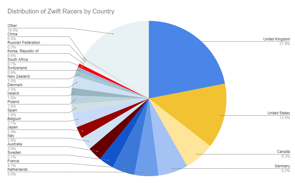
This pales in comparison to the tens of millions that compete in more “typical” video game esports like League of Legends or Dota, but sits comfortably nearby other “tier 2” esports such as car racing, real time strategy, or fighting games which often have similar sized ranked ladders and online players at a given time.
The major difference being, of course, that every pixel a character moves in Zwift is driven by muscles in real life pushing against real-world pedals on various flavors of stationary bikes, often at close-to-max heart rates!
To get a sense of what this average Zwift racer looks like, I took a random sample of events from a single day, then selected a random sample of riders from each of those events. More details on methodology and scaling the results to account for frequency below, but the average racer from within the 80k population appears to generally be ~165lbs and putting out a little over ~3.0 w/kg over a 30min race at an average heart rate of 155-160bpm. While not Olympic caliber (international pros tend to have w/kg outputs of ~6+ w/kg according to this article), these appear to be relatively healthy “players” putting in significant physical efforts every time they compete.
This has interesting implications on how often the “game” can be played relative to other esports. Zwift racers typically compete in one ~30min race per week. A smaller percentage (10-15%) compete in several races per week, while 5-10% are racing daily or every other day. As expected, this pales in comparison to top video games where average players often compete multiple times per day and can easily rack up hundreds of hours weekly.
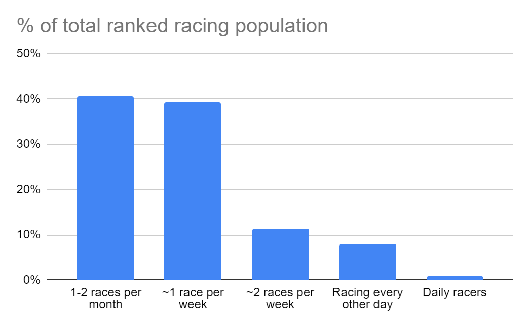
[Methodology note: To get a picture of the average Zwift racer I chose a single day and randomly selected a set of events that occurred during that day, then collected data from the profile page of a randomly selected 10% of the racers from that event. That gave me a picture of the average racer on a given day – which is naturally biased towards racers that compete more frequently. To try and account for that bias in the averages, I categorized each racer’s profile by race frequency, then weighted their contribution to the stats by the likelihood they would have raced on that day. So while only ~20% of the racers I randomly selected raced 1-2 times in the last 30 days, this group of riders likely represents 40-50% of the total race population. On the other hand, a different ~15% of the riders I randomly selected raced almost every other day on average, but because the sampling method was so biased towards choosing them, they likely account for only ~5% of the total racing population.]
So that’s the “average” Zwift racer you might see sweating around the virtual course in one of many events. The next section takes a look at those events, and how the riders break down within racing categories across those events.
Zwift Racing Event and Category Overview
Zwift races occur within scheduled events of which there are a huge number (~1000 per week), kicking off at all hours of the day (~4-5 start every hour). Participation in these events varies by category, which are largely self-assigned designations based on watt output. Most races tend to allow a rider to join as either an A, B, C, or D, and trust the racer to choose an appropriate category. Racers racing below their category can be disqualified after the fact but there is no indication within the race itself. While the results are tabulated within a category, depending on the event you may actually see (and race against) riders from other categories. There is also a separate “A+” category for elite riders that often get lumped in with the broader “A” category.
| Category | Total Ranked Population (% of total) | w/kg threshold | Average races/month |
| A+ | 1,500 (2%) | 4.6+ w/kg | ~9 |
| A | 7,500 (7%) | 4.0+ w/kg | ~9 |
| B | 35,000 (43%) | 3.2+ w/kg | ~4.5 |
| C | 30,000 (37%) | 2.5+ w/kg | ~3.5 |
| D | 8,000 (10%) | open | ~3.0 |
Two points of note – one is the absolutely huge portion of the overall ranked population (almost half) that competes in B. The second is due to the frequency at which the average category A racer races on average, they end up accounting for a large portion of total races, despite being only ~10% of the total racing population.
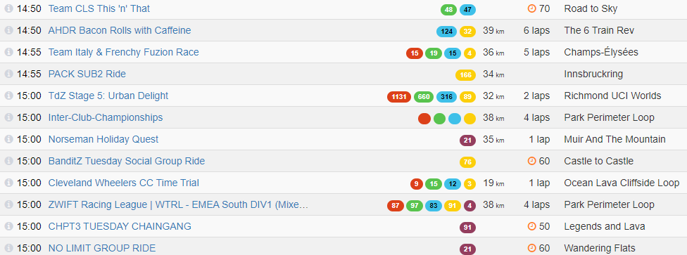
So that brings us to the actual events themselves. While we all wait breathlessly for the new Zwift homepage redesign that may make finding events somewhat easier, right now, prospective racers are confronted with a long and highly variable list of potential events to enter at any given moment. As of this writing there were 12(!) events starting just within the next 10 minutes. But within these events, there are a few regular organizers that account for a substantial portion of the total races.
#1: WTRL
% of total Racers: 38%
# of Races / week: 98
Avg racers per race: 193
Average Distance: 34km
Category distribution:


WTRL is the official organizer of the Zwift Racing league (ZRL) as well as several other series of races. The Premier League of the ZRL is live-streamed to thousands of viewers and includes many professional cyclists. Entry into the ZRL races requires being on a team. Relative to other event organizers, these events are much more biased toward higher category participants. In fact, over 50% of the total Cat A race entries were in WTRL events over the course of this week.
#2: 3R

% of total Racers: 12%
# of Races / week: 151
Avg racers per race: 38
Average Distance: 28km
Category distribution:

3R is one of the most prolific event organizers, with races starting almost every hour. These races tend to occur on popular courses and typically have group (mass) starts – while results are calculated within a category, racers will see, and start with all of the other categories out on the course. These events are a great choice for those in between categories looking to try and keep pace with a higher category than their current one.
#3: Zwift HQ

% of total Racers: 9%
# of Races / week: 95
Avg racers per race: 45
Average Distance: ZHQ: 22km Crit City: 18km
Category distribution:

Zwift itself organizes a regular series of races, both on the standard Crit City courses as well as experimental races testing new features including steering, anti-sandbagging, or removal of the HUD. These races tend to be relatively short, relatively well attended (except for category A), and feature separated starts so the majority of people you race against are within your category.
#4: Evo

% of total Racers: 3%
# of Races / week: 37
Avg racers per race: 45
Average Distance: 18km
Category distribution:

Evo is another regular organizer of races that tend to focus on shorter courses, ideal for racers looking for quick <20km rides that fit within your schedule. Similar to the Crit City/Zwift events, these are separated starts and tend to be well attended outside of category A with even more of a bias toward category C and D riders.
#5: KISS

% of total Racers: 2%
# of Races / week: 14
Avg racers per race: 74
Average Distance: 45km
Category distribution:

KISS is one of the original race organizers on Zwift and has fewer races overall, but they tend to be on the larger size with an average of ~75 attendees and are very popular with category A riders. These races also tend to be much longer than other popular series.
Other
There are a huge number of other event organizers such as DIRT, DRAFT, DBR, EVR, Wahoo, etc. putting in tons of work with high quality and creative events. ~⅓ of total racing occurs in these other series, some of which happen many times per week.
% of total Racers: 36%
# of Races / week: 413
Avg racers per race: 43
Average Distance: 45km
Category distribution:
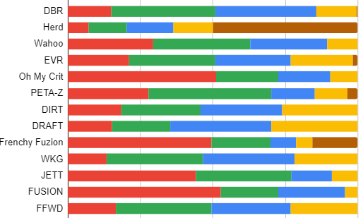
[Methodology note: For this data, I downloaded the event result list from the past 7 days (max available on ZwiftPower at any given time) for the time period 1/16/22-1/22/22. Admittedly this is a somewhat weird time in the Zwift racing calendar given the ZRL kicking off, but again an interesting look at the common races Zwifters are competing in.]
Wrapping It Up
To summarize the current Zwift racing landscape:
- 80,000+ ranked racers from around the world
- Each racing about once a week
- Largely in categories B and C
- With racing split roughly in thirds between the ZRL, the other top event organizers (3R, ZHQ, EVO, KISS), and a long tail of smaller event organizers
In the next post, we look at how Zwift racers are ranked, what the distribution of those ranks looks like, and the blurry lines between categories.
Questions or Comments?
Share below!



I’d be curious to see the split between male and female racers. I have a suspicion, but I’d like to see the actual numbers.
Great idea. Haven’t actually pulled that data but could take a look
Surprised about Belgium being absent on the graph. Is it correct?
I didn’t find any riders from Belgium ranked between 550 and 600 in my scans so right now they are in “other” – but if you send me an example rider happy to include them!
ZwiftID 1417308 is the lowest ranked rider in Belgium, 599,81 points and placing 86.840th overall.
Source: go to menu Rankings / Individual, select Belgium as country, sort on Ranking descending. Lowest ranking is 480,59, but only top 1000 is shown, so you have to dig further. Select Category D, then click through the pages until you find the lowest ranked rider 600 on page 17 – which is the ZwiftID mentioned above.
Great thanks, hadn’t thought of doing the filtering strategy for specific countries. They are 2,700th in their country so would put Belgium at about the size of Australia in terms of population. I’ll update the chart
I just did the same filtering for Denmark – Rider 1752313 haas a ranking of 599.99 and is number 3326 in the country, so Denmark would be in that Pie Chart as well
You got Sweden twice in the pie chart
Oh yeah, that’s definitely wrong. Thanks for catching it – will update
Could one Sweden be Denmark?
Excellent article, I love a bit good bit of data. Very interesting. I’d also like to see female data, and maybe age groups
38% of the platform race in WTRL, thats a problem for Zwift.
Not sure if you think that is too high or too low? It’s nice the official races have such high attendance, and also that there is a wide range of other events / organizers out there that are putting out high quality content. I think it’s a good balance
I am not sure how players can manage hundreds of hours weekly.
Come on, they can manage hundreds of hours easily 😂
Realistically 40-50 hours of not unusual for amature but committed gamers.
I had the same question. With only 168 hours in a week…
Haha excellent point. Got a little carried away 😂
Very interesting. Would it also be possible to break down the distribution of riders to the .1 wkg scale? I’m suspecting a peak just below the cat border and a valley just after – eg a saw tooth distribution – , but this has always only been a suspicion.
Also, it would be great if this could somehow be compared to overall Zwifters – which may show a more normal distribution – but that probably relies on data you don’t have access to.
Thanks for the thought Marco!
I could breakdown the distribution based on actual performance during races pretty easily, but what we would see is that B races, for example, tend to cluster around 3.6w/kg (the pace of the peloton). I think what you are looking for is what the distribution of max 20min w/kg is? Which I sadly don’t have readily available, could be an interesting follow-up though!
Holy Sh*t this was a great article!
Enjoyed this article, thanks. I always thought there were more Brits in game.
Great content: thanks for the analysis. Really interesting.
Great article! Just curious if you could list riders per country per capita. There seem to be a lot of Norwegians racing on Zwift for a small population country.
Jim I had a similar curiosity. The UK, Canada, Netherlands, Sweden, New Zealand seem to “overindex” based on the chart. Perhaps bc these countries have a) more active cyclists generally or b) poor weather a good chunk of the year.
Great article thanks! Like others, I’d like to see some other demographics, like age categories and gender.
The amount of UK racers intrigues me – I wonder if it is related to language on the platform(s)?
The learning curve for getting onto ZwiftPower has been really steep until the recent introduction of an SSO. I wouldn’t be surprised to see, that the percentage of racers who are on Zwiftpower is a lot higher in english-speaking countries and countries with a lot of english speakers.
I know, that some of my IRL friends have almost given up on getting on Zwift in the first place and have never gotten on ZwiftPower simply because they couldn’t figure out how it works.
So while this article gives some really interesting numbers, it would be really good to see numbers from Zwift instead of from ZwiftPower, because for many races less than half of the participants are on ZwiftPower. But I guess, Zwift doesn’t want to give out those numbers…
I think we also have a lot of organised road riders (i.e. members of a cycling club / British cycling, as opposed to casual bicycle riders) yet terrible weather and terrible drivers. It’s a recipe for Zwifting.
Another metric, that is highly affected by using ZwiftPower-numbers and not Zwift-numbers is the category of the riders. The percentage of A-riders on ZwiftPower is probably a lot higher, than the percentage of D-riders on ZP.
I just did a highly scientific test (sample size of 1 – event ID 2675422) to see these numbers.
On Zwift Companion app, the number of riders completing in each category was:
A: 15, B: 44, C: 35, D: 60
On ZwiftPower, the number of riders in the unfiltered list (so how many were signed up to ZwiftPower in the first place):
A: 13, B: 35, C: 21, D: 17
In percentage of the number of rider in the event in each pen, this is:
A: 87%, B: 80%, C: 60%, D: 28%
And just for complete numbers, after filtering (DQ out of the way, the numbers actually ranked in each pen):
A: 12 (80%), B: 28 (64%), C: 14 (40%), D: 6 (10%)
So looking only at riders on Zwiftpower and only ranked riders will bias the numbers quite a lot towards the higher categories. Only 28% of the riders in the D-pen in this race were even registered on ZP – so I assume, the actual number of people racing on Zwift is a lot higher. In this event for all categories, only 56% were registered on ZwiftPower in the first place…
I think the stats above are really interesting; especially the ones showing how often the “average racer” in each category races.
I’d also like to see more about how stats on ZwiftPower racers compare to stats on overall Zwift racers. If we solely focus on ZP and there are disproportionately less D riders than in the overall population, we risk ignoring what those Zwifters want.
I genuinely think that – if all of them raced – the vast majority of the Zwift population would be classified as being in C or D. And that probably lines up with the gaming analogy – while some may game all the time and become “better and better”, the vast majority game less often.
Super interesting observation – didnt think to check the companion app for attendance numbers. Feels like it should be a follow-up post! Thanks for the thoughts!
I’m not sure, how easy it is to harvest data from the Companion App – maybe some crowd-sourcing of numbers from races people do for an entire week could be a way to get some combined numbers from Companion App and ZwiftPower?
With 80% of racers in just 2 categories, B and C, it really highlights they need at least 3 cats across that many to make the racing better.
C+ at 3-3.5wkg would be banging then B at 3.5-4.0 ish, jump from C->B is massive atm
interesting that there are more riders in Cat B than C. I usually see more racers signed up to Cat C events than Cat B so would have thought it’s the other way around. 3-4wkg is no joke!
I think it might be what @Claus-Jensen pointed out with there being fewer C riders registered for ZwiftPower than B riders.
So overall, more C riders, but more B riders on ZwiftPower.
Very interesting, thanks. Would you be interested in diving a bit deeper in to the rankings, more specifically, the flaws of the existing ranking system, and what alternatives (e.g. MS TrueSkill) could bring to the table, for ranking to one day be an option for race organisers to split pens?
Hi Eric,
1st things 1st: I do love your Homepage. Great info – keep me updated and addicted to ZWIFT 🙂
I do an average 6.000 km each year on my race bike (3K on Zwift) for 3 years and consider myself a reasonably fit cyclist. My FTP is around 235 and weight is 101kg.
If I look up for rides on Companion App I am impressed by the level. Lowest level is normally at 2 Watts/kg = 200 Watts in my case. And if I join it get´s even worth as the guys go easily 230+.
I cannot (or stubbornly do not WANT to) believe that I am the only one struggling to “compete” even at the lowest level – knowing that there are 4 more up!
Question: Can you share any analyses about the typical ZWIFTer? How many are in which class (A-D) … and how long did it took them to get there.
Found your great article about Racers (https://zwiftinsider.com/racing-landscape-1/ ), but I do not necessarily consider them as “the norm” – or am I wrong?
Thanks a ton for any feedback.
Hey Basti,
Thanks for the thoughts! As others have pointed out, the above analysis in this article only really looks at ZwiftPower users who have opted into the platform. In realty the population of lower category riders is much much higher than represented here, which could be thought of as the population of more intense / hardcore racers who have opted in to this separate system to try and bring some additional “fairness” to the rankings.
Unfortunately Zwift itself doesn’t release any data, all of this is from zwiftpower. But I can definitely tell you that from my own riding around Watopia, by far the average rider seems to be going 1.5-2 w/kg and is much more in line with what you are describing
Joe
Two Swedens would be a Finnish nightmare 😀
Also worth remembering. All who race in the WTRL-events will also have to be Zwiftpower since it is required to be able to race with them. So there you have a 100=100 since all showing on the companionapp should also figure om ZP. It is not the same case with the other arrangers…
I enjoy these breakdowns and use of the publicly available data. Question on the distribution of riders: you chart above indicates that about 9% of riders are 4.0 w/kg or higher. When I look at my profile (20 min w/kg = 4.28, so FTP = 4.07w/kg, i.e. just over the line), ZP shows that I’m in ~70th percentile. Any explanation for the differences? Would it because your sample is only over a certain period of time when possibly fewer A riders are riding, while the ZP percentile covers the history of riders that have posted records (i.e. the ZP percentile include inactive riders)? Keep up the great work!
I think I figured out part of the answer: lightweight B riders that are > 4.0 w/kg FTP, but < 250W FTP. I'm that sure that is a small percentage of it, but that is certainly some of it.
7 weeks and still 2 swedens on the chart lolz
Hi Joe, great data. I’d be interested to know roughly how many zwifters there are in the UK. Is it possible to estimate this? Thanks.
Looks like they are ~20% of the total population on zwiftpower and I think estimates are of 500k-1M total zwifters – so 100-200k total in the UK?
I would love to see which days of the week are most popular for Zwift both for general all-riders count, and racers specifically.
Hi Joe,
Is there any chance this info could be updated for 2024. As a gamer and rider it would be great to really see where my score sits relative to total racing community. Has the racing community grown. Ho how many racers are in my various categories in country, region, globally etc.
Yes you ain to beat yourself but also to your peer group relative positions.
Thanks,
Mark