

Yesterday’s Zwift update included the release of a long-awaited feature: a draft indicator! It’s a very simple yet useful addition to the game UI: a horizontal blue line that expands and contracts at the bottom of the center HUD element. This animation shows how it basically works:
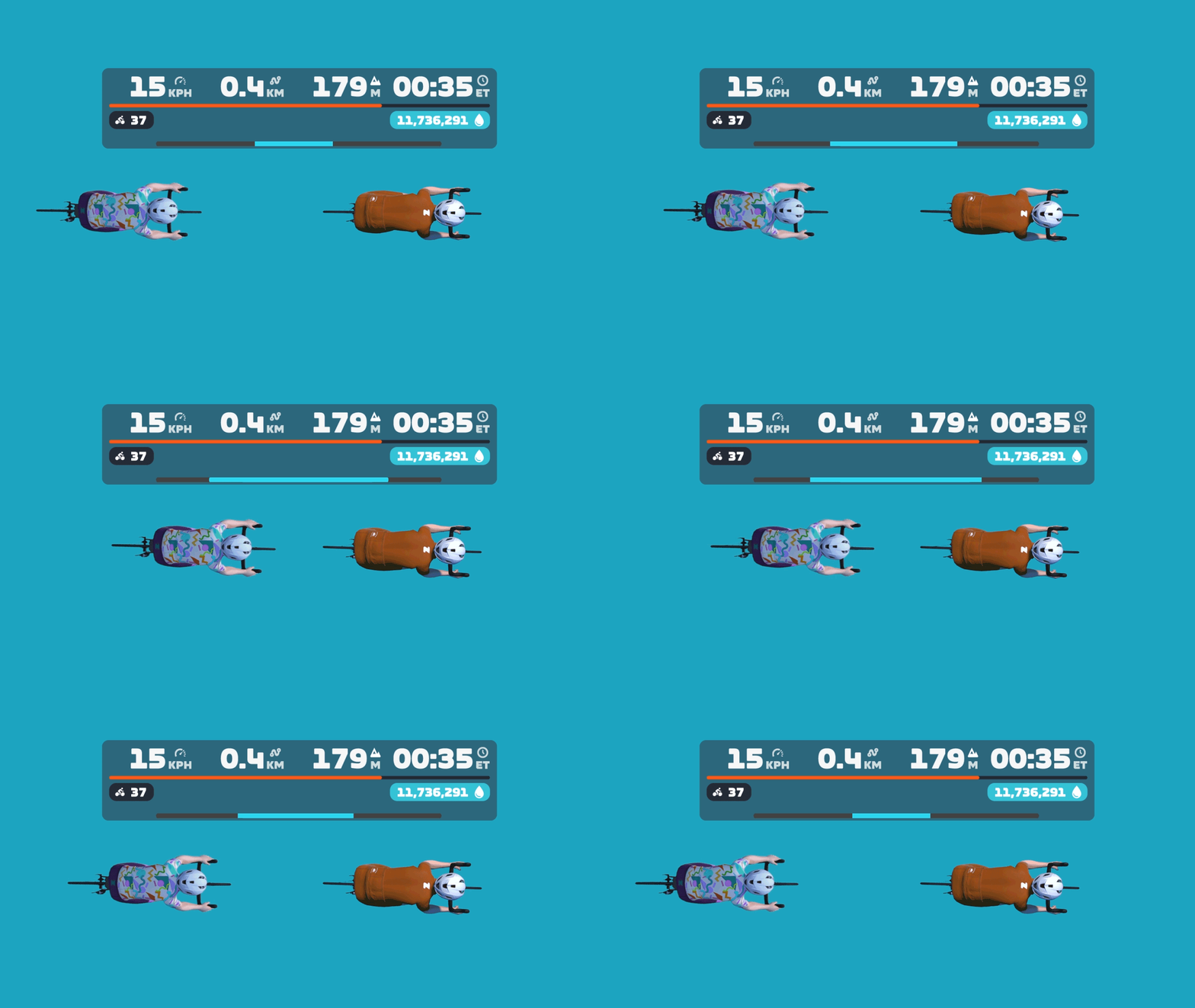
Want to see it in action? Here’s a quick recording I made while spinning around Watopia yesterday:
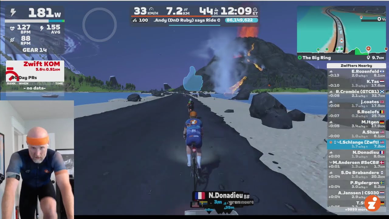
Into the Weeds
The new draft indicator, in typical Zwift fashion, is a very simple UI element. But there are lots of details worth discussing, so let’s dig deeper…
What are we measuring?
This is a tricky question to answer, actually.
The blue bar isn’t showing exactly how much power you’re saving. If that were the case, it would be wider when drafting two riders at ~60kph on flat ground, vs drafting the same two riders at a lower speed. But that’s not the case. The bar is full even at 34kph, as shown here:

And here you can see it’s filled to the same level drafting off of one rider, whether I’m saving a lot of power at 48kph, or less power at 34kph:


The blue bar is also not indicating how much of the potential draft you are experiencing. If that were the case, the bar would be full when you’re on a climb in the middle of a pack, receiving as much draft as possible in your current location. But that’s not the case. On steep climbs, the bar only fills partway:
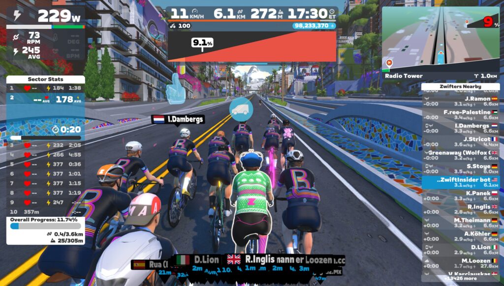
So what is it displaying? I think it’s best to think of the Draft Indicator as showing what percentage of your power is being saved in the draft. This isn’t a perfect description of what it’s showing (especially since the blue bar fills up even when you’re coasting), but I think it’s as close as we’re going to get.
A Note About Bar Width
No, I’m not talking about the UCI’s controversial recent stance on handlebar widths. I’m referring to how the draft indicator’s design could stand to be polished a bit. Currently, the draft indicator bar only fills ~80% of the HUD’s width, but it’s so low-contrast that you can’t really tell how wide the bar should be, if there’s a dark background behind the center HUD:
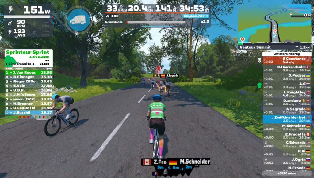
Because of this, when the bar is fully filled, it can look like it’s only partially-filled, since it doesn’t go to the edges of the HUD.
The bar only expands to the edges of the HUD box when using a Draft Boost powerup (see below). But perhaps the bar should be the full width at all times, then a Draft Boost powerup changes the color of the indicator, or the bar expands to be a bit wider than the main HUD element?
Draft Boost Powerups
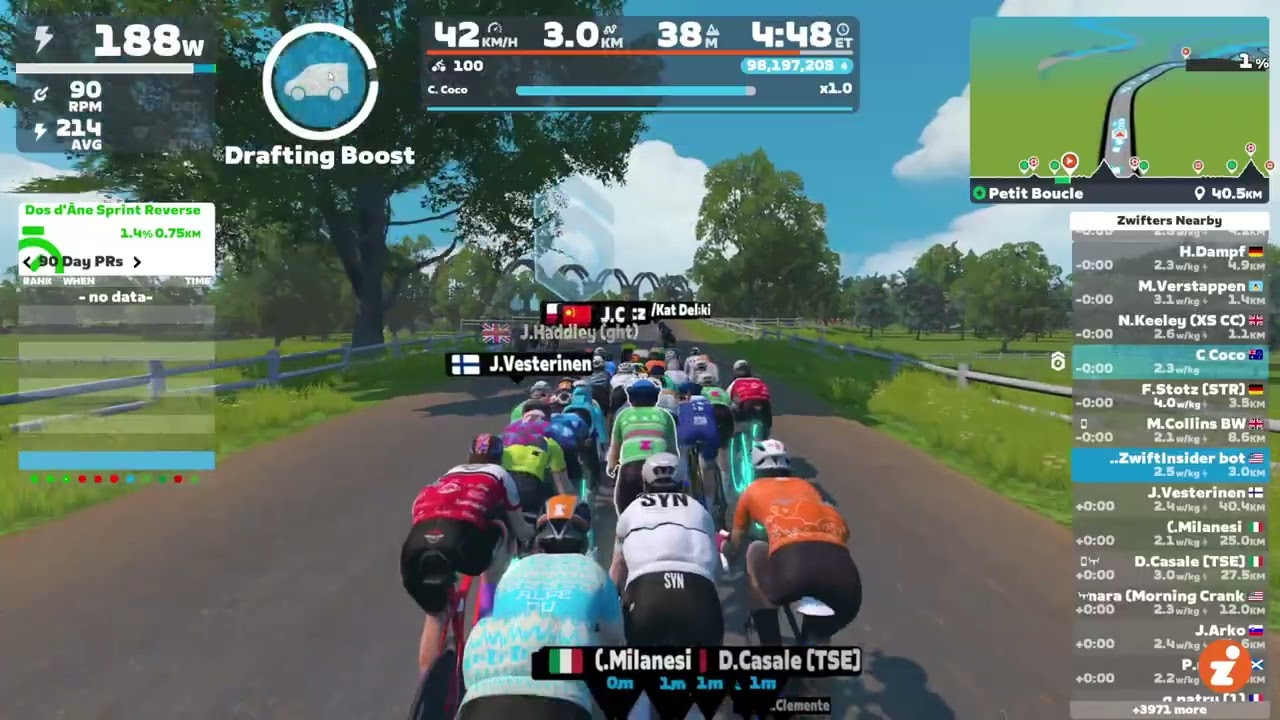
What happens when you activate a Draft Boost? I’m glad you asked. Here’s a demo:
How many riders for max draft?
How many riders have to be ahead of you for you to fill the Draft Indicator to max? The answer appears to be two, at least on flat ground at a descent speed.
If you’re well-positioned behind a single rider, the bar fills to this level (around 75% of max):
But get behind two riders, and it fills completely:
This doesn’t quite line up with my Pack Dynamics tests from past years (see Test 2 in this post, for example), which seemed to show that a 4th rider got a bit more benefit than the 3rd rider in a TTT. But my guess is the discrepancy can be explained by Zwift’s new draft indicator having a cap on the power savings it displays, as explained in “What are we measuring?” above.
Goodbye, “Close the Gap”
Zwift says the “Close the Gap” text will be retired with the rollout of the Draft Indicator. I don’t think anyone will complain about that, as long as the Draft Indicator is always visible in its place! (“Close the Gap” was a handy tool in TTT’s… IYKYK.)
How Far Back?
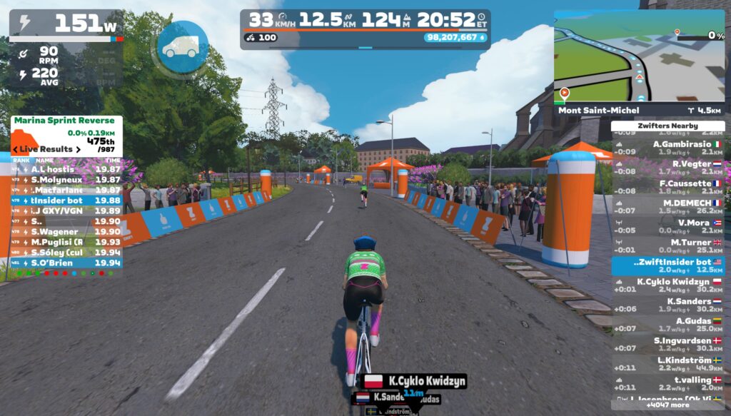
One thing the Draft Indicator will teach Zwifters is that you receive a draft benefit from riders quite far up the road. How far back can you be, and still receive some benefit? I don’t have precise measurements, but here’s a visual showing where the Draft Indicator begins to show a benefit on flat ground at 33kph:
Zwift vs Sauce for Zwift
Until this week’s release, the only draft gauge Zwifters could access was the one provided for Sauce for Zwift. Here’s a quick demo video where I compare Sauce’s drafting gauge and Zwift’s new Draft Indicator:
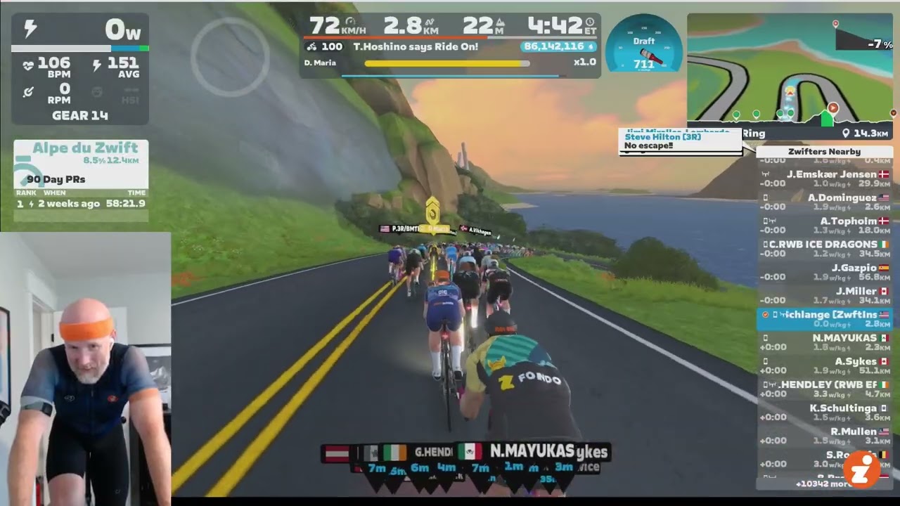
Sauce’s gauge is titled “W Savings” to indicate that it is showing how much power you’re saving in the draft. This isn’t perfectly accurate, though, as it’s actually showing you how much more power you’d need to be doing to hold your current speed on flat ground without a draft.
Some Zwifters prefer having an actual number displayed. But I think Zwift’s choice to keep it a simple bar is probably the right call, in the interest of keeping the HUD clean and simple.
Drafting Ghosts
With the Draft Indicator now being used by hundreds of thousands of riders, people are going to start discovering new things.
For example, on Zwifter wrote in yesterday to tell me they discovered in a Ladder Race that you can draft off of someone who is invisible due to the ghost powerup. I’d already written about this a few years back (see the post), and of course it makes sense: everyone knows ghosts still have bodies, even if they’re invisible. Right?
TTT Drafting
While Zwift’s Draft Indicator announcement in the forum says, “this indicator will not appear when riding a TT bike…” sources in Zwift tell me that’s not actually true. If you’re in an event where TT bikes can draft (like a TTT), Zwift says the Draft Indicator will be visible. I guess racers will find out tomorrow if that’s true!
Questions or Comments?
What do you think of the new draft indicator? Comment below, and you can also chat on this Zwift forum topic.

Instead of the line, I think they should have used the circle around the PU… but that is just me
Tried it, don’t like it as I do not tend to look at the hud if I am in a race or with a group. Bring basck the old way.
The pedal games app has a draft widget that will show watt savings also.
It certainly does!
It’s pretty nicely implemented. Maybe an outline around the gauge would be enough. Or perhaps a left-to-right ‘health bar’ style.
I know lots of people have wanted a draft gauge in-game for ages. I don’t really see the need for it. When racing, you know where you need to be to save energy. But the nice thing about this implementation is, it doesn’t really bother you if you don’t use it. Not like the climbing drop down people griefed about (but which I love!).
I second the ‘left to right’ health bar-like suggestion! Or filling up the ring around the power up button, which could then properly link with the draft power up so you can clearly see if you’re at current possible max draft or not. But welcome the addition of some form of draft measure so it’s a good improvement and step in the right direction.
Nice idea….
But…..
CAN’T THEY CHANGE THE WHITE LETTERING ON THE YELLOW PACER BOT TO A DARKER COLOUR.
Ta. 😁 😁 👍
“IYKYN” – if you know you…[…]?
no
“If You Know You’re Not Good At Proofreading…”
“The bar only expands to the edges of the HUD box when using a Draft Boost powerup (see below). But perhaps the bar should be the full width at all times, then a Draft Boost powerup changes the color of the indicator, or the bar expands to be a bit wider than the main HUD element?”
I think adding a white filler bar from the center to the ~25% of the draft bar overlaid on top of the “100% filled” to match the white countdown bar/circle around the power up would be intuitive maybe? Or yellow for contrast/showing bonus draft essentially.
I find it interesting that it’s difficult to articulate what it’s actually displaying. This doesn’t feel like good design to me.
This was my thought. How can they release a feature and not be able to clearly tell us how it works or what it truly means?
I really don’t get the “expand from the center to what you might be able to tell is 80% of the full width” design either.
“Wide easy, narrow hard”
That wasn’t so difficult now was it?
I don’t know, you clearly seem to think I’m an idiot so this should be beyond me.
Percentage of potential draft available. That’s what’s being displayed
Not exactly, since it’s never full if it’s a steep gradient (even if you are at 100% potential)
I reckon that’s probably a bug. On steep gradients Zwift artificially limits draft (for some reason), and I would guess this limiting is not being included in the draft bar calculations (but should be).
It’s good that the developers are adding new functionality (and this is something that a lot of people have wanted to see), but it’s disappointing that Zwift continue to make many elements of the HUD mandatory unless you turn the HUD off entirely. I’m autistic, and find it very difficult to ignore movement or flickering on-screen – while I like having the ride data available (power/HR/cadence, ride stats, etc.), I can only see these if I also have all of the shifting and moving stuff (like rider name badges and power-up icons as well as the new draft indicator) on-screen as well, and these make my rides in Zwift a less comfortable experience than it could be.
I agree. The first time I saw it was on a busy ride of the week and I found the placement to be incredibly distracting. I think the feature has value, but having a line “breathing” in the middle of the screen is more annoying than helpful for me.
I agree it would be nice if the HUD blocks could be chosen individually. An alternative that might work for you is to disable the HUD and then use the Companion app on a phone as a small and potentially less-distracting dashboard.
I think it’s great. Percentage of maximum available draft is the best matrix. Saving 250W in the draft can give a warm feeling inside but does not mean much if the rider next to you is saving 350W. It will be especially helpful in TTTs, where it’s always difficult to guage how close to be from the rider Infront, to gain maximum draft. Well done and thanks, Zwift.
Guys, they really need years to program stuff like this…be patient with them…
When I have a large TV, the draft indicator is too high for the avatar. It should be at the bottom of the screen.
All this waiting and it’s still worse then sauce (for me). While the number in Sauce might not be completely accurate. It does tell me how much watts (give or take) I need to do to maintain that speed on the front. That is usefull information for me since it gives me a indication how screwed I am if I was thinking about a break away.
To say something positive: In the last race I raced this indicator had suddenly appeared and not only did I know after a few seconds what it meant, some other riders also noticed that and started discussing it on the chat (though I still don’t understand how you can chat during a race, I always need all my power and focus to stay in the bunch).
So it’s not really counter-intuitive. I like it and I’m happy that it’s there now.
TBF no who posts on this website has anything positive to say ever. about anything.
And I thought drafting well was a skill that had to be learnt
The indicator is an aid in learning the skill. It does not make you immediately good at drafting.
Super stoked to hear the “close the gap” text is going away. It’s obnoxious and has bugged me for years.
Used it in last night’s TTT (on a TT bike). Worked well, good enough to tell when you were in a draft or not, especially useful when starting to half wheel and the draft disappears. I am sure it can be improved, but a lot better than not having it.
Not too worried as to what exactly is being measured. Am I still getting a good draft, is it increasing or decreasing are basically all that I need to know, which this does simply enough
Great, thanks for confirming it works in a TTT!
It does work in TTT events for TT bikes. But darn the secret is out about drafting :_(. I liked the old way where your rider just got out of the drops and on the hoods to know whether or not you were drafting.
Although on a TT bike in a TTT there was no visual cue before
Odd. My draft bar fills completely behind one rider and the goes all the way to the edge of the hud behind two riders.
I’m on Mac OS to clarify.
Is there a way to turn it off? I use Sauce and it’s better (IMP)
I like it. Went up AdZ with the robopacer, and at best, only got the draft meter to about 25-30% of full. Suggests that the robots are a bit more aero.
I don’t use Sauce (I zwift on my phone), but the W saving is a different data point. Both would have uses, though it would be nice if they filtered out the watt saving due to gravity. Not my circus, not my monkey.
When I was newer to the game, the close the gap messages drove me insane, to the point where I started riding a TT bike all the time, just so I wouldn’t see it. 😉
Glad to see this implemented in the Zwift UI. I’ve been using Sauce for this feature. The Sauce implementation is artistically silly, and you can’t think about the numbers too hard. I appreciate that I can resize it and place it to be as prominent as I want, and the gauge is a very quick read. The Zwift implementation is too subtle. It looks like a small underline. This tiny line requires me to compare how fully it extends to 80% of a shaded box that I can barely see. This is asking for a lot of blood flow to be redirected from my quads to my brain to decipher. Making the line 3 times thicker would help. The other Sauce feature that I use is the time to other riders and where I sit in my clump. If Zwift took that on as well, I could save $2.15/month, and I wouldn’t have to keep explaining to my skeptical wife what that recurring Patreon charge is all about.
I noticed the bar this morning, before reading about the update news, and thought to myself “what’s that, I wonder if it’s a ‘draft-bar'”. So I started to test it whilst on the SZR Sunrise Ride and became convinced that it is a ‘draft-bar’ and I think it is extremely encouraging to stay focused on if I start to struggle in a race or a group ride. Thanks for posting this and confirming my suspicions were correct.
I love it. That is all.
Just a friendly request from a fellow nerd. Most scientists put a space between a number and its unit. Rules and exceptions to the rules can be googled.
Not everyone wants this. Those who do, want it real bad. Kudos to Zwift and the designer for a useful and intuitive solution that threads the needle on simple usefulness without being overly in your face.
Hey Eric,
I switched to a PC and the blue bar of the draft indicator disappeared in the game. Have you ever seen something like this before? Any idea how to fix it?