

During the last couple of months, I have been logging onto Zwift at random occasions, both day and night, to write down the number of Zwifters in each world. The Companion app gives the total number of Zwifters, so it’s possible to calculate the number of Zwifters in the worlds not on rotation as well.
Why Is This Interesting?
Having numbers through different times of day, and across longer periods, can be regarded as customer data and be used to predict customers’ preferences, desires, and future behaviors. This is a central component of data-driven marketing and probably the type of data Zwift use to plan further expansions and the road ahead.
Zwift does of course collect detailed continuous data on many aspects of use. Not only which nationalities are riding and where they’re riding but also how long people spend in each world, their favorite courses, and where they push the most wattage. A limited dataset cannot give very detailed information on customer data but can still be analyzed for interesting trends. It might be used to at least answer some questions on the average Zwifter’s preferences and behavior. Here I have applied some flexible statistical models that correlate data nonlinearly and control for several effects at the same time to the data I extracted. The point was to shed some light on a few of the most basic questions.
When Does the Average Zwifter Ride?
Whether you like to outsprint slower riders while hanging on to faster ones, or you think some worlds are getting too busy, it can be useful to know when the number of Zwifters peaks.
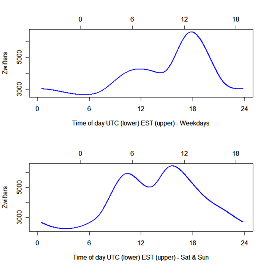
The figures above show the expected number of Zwifters through a 24h period in Watopia in the middle of December. The expected absolute number of Zwifters in the other worlds on rotation will be different, but the trend through the 24h period is here modeled as the same no matter where. The model did also include a trend through the period, so different dates will also have different absolute numbers.
The patterns are different during weekdays and weekends. Not surprisingly, on Saturday and Sunday the peak period is wider, maybe with two peaks at around 10:30 UTC and another at nearly 16:00 UTC. During weekdays, the most prominent peak is the “European afternoon” peak at 17:49, while the earlier peak is less prominent. In addition, the weekend average is 361 riders more than during weekdays. The time with the lowest activity is around midnight EST (or Zwift Standard Time, since that’s when the worlds are changing). If we assume that most people are Zwifting after work on weekdays (1700-2000), the patterns of Zwifters throughout the day would best fit Europe and have least activity in the US and East Asia.
What is the Most Popular World?
The average number of riders in each world could be regarded as a popularity index. So, here is the list with the average number of Zwifters in parenthesis from lowest to highest when time of day and date is corrected for:
| Rank | World | Average # of Zwifters | Days in Rotation in period | # of Routes |
| 10 | Paris | 838 | 10 | 2 |
| 9 | Worlds not on rotation | 1131 | Always available | NA |
| 8 | Yorkshire | 1213 | 18 | 5 |
| 7 | Richmond | 1251 | 13 | 3 |
| 6 | Innsbruck | 1691 | 17 | 5 |
| 5 | New York | 1718 | 21 | 11 |
| 4 | London | 2962 | 14 | 13 |
| 3 | France | 3622 | 10 | 7 |
| 2 | Makuri | 3751 | 21 | 20 |
| 1 | Watopia | 4487 | Always available | 34 |
Watopia is by far the most popular world. France and Makuri clearly round off the podium but are nearly indistinguishable, with the difference being on average only 129 riders in favor of Makuri. (This is despite Makuri having the novelty factor of Neokyo launching during in this period.) France’s popularity could be boosted by always being paired up with Paris, the least popular world.
In terms of number of Zwifters, the UCI worlds tend to be less popular, but New York as well, just barely ahead of them. If we further look at the true observed number of riders in Watopia when only the less popular UCI worlds are on rotation, the observed number of riders are often higher than expected from the model. This means people tend to choose Watopia in favor of Richmond, Yorkshire, and even London. However, when France and Paris are on rotation on average 109 riders less than usual selects Watopia. This is even more skewed when Makuri and New York are on rotation. On these days, nearly 200 less riders choose Watopia.
Popularity could be linked to availability as France and Paris have a high popularity and are the worlds with the fewest days in rotation in this period, less than half of Makuri. However Watopia is always present, and Makuri had the highest number of days in rotation in this period.
Small worlds with few routes could be expected to be less popular. Paris is a rather small world with only 2 routes, so it wouldn’t be expected to have the same numbers of riders before getting too crowded or people having checked off the badges. However, if we divide the number of Zwifters by the number of routes available in each world, France and Paris comes out on top, while Watopia, New York, and Makuri constitute the bottom three. This could indicate that some people to a larger degree ride the same routes over again in the smaller worlds.
So maybe different people choose different worlds? The model assumed the same curve through the 24h period for all worlds. If some worlds are more popular at specific times of day, the model will have a larger deviation between the expected and observed number of Zwifters at those periods. If we combine the two old favorite worlds Watopia and France (and they do indeed have a similar pattern), we can look for trends in the deviation from the expected (we leave out Makuri since it has Neokyo that probably have a large appeal to all Zwifters to test):
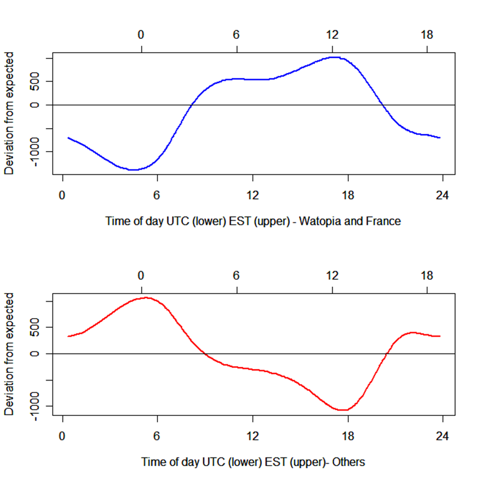
The two graphs show the trend in deviation between what is expected from the model and what is observed. A high positive number indicates a lot more people were observed in the specific world at the time than the model would expect based on a standard relationship. The observed number of riders in Watopia and France are on average nearly 1000 riders higher during the “peak” periods (1700-1800 UTC) and more than 1000 riders lower during the UTC and EST nighttime. On the other hand, people riding at UTC and EST nighttime tend to choose to ride in a world not on rotation (using world hack or participating in events).
So, France and Watopia are very popular with the typical, maybe European, Zwifter, and the realistic UCI worlds are not the most popular across any time zone. If Zwift wants to try to attract new customers, and maybe they consider Europe to be nearly fully utilized, it makes sense to expand on new fantasy worlds.
By this time I realized my hopes of riding the UCI Worlds road race course in Belgium on Zwift was diminishing…
What Effect Did the Neokyo Release Have?
So Zwift’s world expansion strategy is not a secret. They have launched Makuri Islands, added on Neokyo, and stated that they want to expand Makuri as a “sister” to Watopia. But, does launching a new world have a large effect on Zwifters’ preferences? This question is somewhat difficult to answer since I have no data on a typical autumn/winter without a “Neokyo” release. We can nevertheless try to “mine” the data for some assumptions.
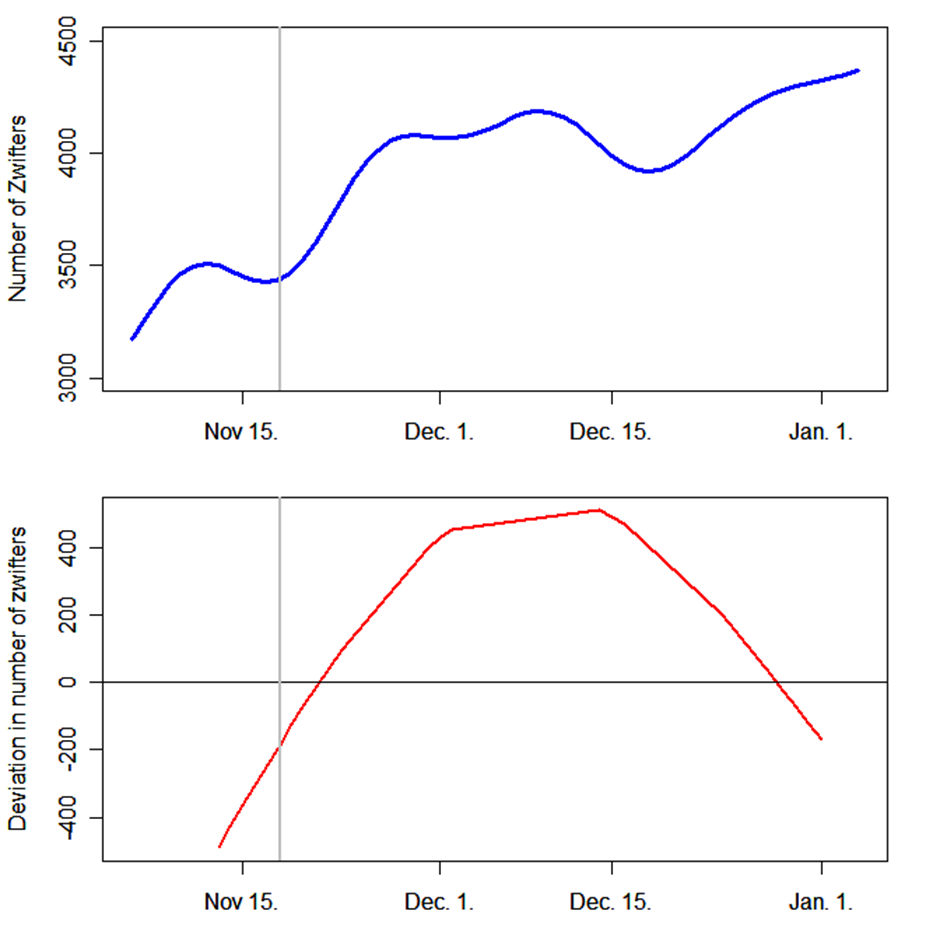
The blue curve in the top plot below is the expected number of riders in Makuri from November 5-January 5. The number of Zwifters increases in total during this period. This is probably an effect of more and more people moving from riding outside to riding indoors during winter in the northern hemisphere. The trend curve has a “two lumped bulb” starting by November 18 being the first date with numbers from Neokyo. If we imagine a linear trend through November and December, the Neokyo effect can be regarded as a surplus until the middle of December. The curve is not specific to Makuri since it’s not modeled differently for different worlds. This means the surplus is present in all worlds and could be an effect of more people logging in to Zwift in general to ride Neokyo.
To consider Makuri specifically we can look at the deviation between actually observed riders in Makuri and expected riders based on the model (with the same date effect extracted from all worlds). This is the lower curve with a red line. It becomes even more obvious that in addition to the increase of 500-600 Zwifters on a daily basis in the early Neokyo days, there were also approximately 800 more Zwifters in Makuri these days than before the release of Neokyo.
I’m a scientist and not a marketing expert, and probably Zwift has tons more customer data to plan their further strategies. But given these limited data it makes sense to keep on expanding Makuri. Although bear in mind that France seems, contrarily, to be a world with limited routes, yet still one of the most popular worlds. And personally, my favorite world is France…
Technical Notes
Data was collected from the Zwift main menu and Zwift Companion app:
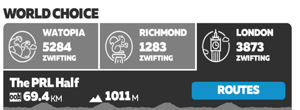
The analysis is based upon the assumptions that these numbers are real and unfiltered numbers of actual Zwift users, and are not biased in any way. A total of 1144 numbers were used from 285 occasions. Observations were done from 1 to 8 times a day, with an average of 4.7 times. The range of observations per world was from 47 to 286.
Data was analyzed using a generalized additive model given by the equation:

where Nik is the number of Zwifters in the i’th world at the k’th observation occasion. β0i is a world-specific intercept (corresponding to average number of Zwifters in each world), Tks is the time of day of the k’th observation occasion if the day of the k’th observation is a Saturday or Sunday. Tkw is the time of day of the k’th observation occasion if the day of the k’th observation is a weekday. Dk is the serialday of the k’th observation given by days since November 1. β1k is an offset if the k’th observation is a Saturday or Sunday.
The s1k, s2k, and s3k are specific smoothing curves (cubic splines), tailoring the effect of the covariates to the response at the different occasions through time and date. The s1k and s2k splines were modeled as cyclic to tailor the effect of the end of the 24h period to the beginning for a continuous trend. The number of knots for the smoothing curves was found using generalized cross validation. εik is the error term being identical and independently normally distributed for all worlds and at all occasions and represents deviation between model expectation and observed numbers. The model explained 90% of the variation in the data.
Questions or Comments?
Share below!


So I take it Zwift is much more popular in Europe (or cycling in general) given the peak times?
We knew already from events like ZRL that there are more European racers than otherwise and it would make sense if that is also true for “free riders”
I’m not sure if Zwift is more popular in Europe (in riders per 100,000 population). It certainly has more riders on Zwift but Europe has twice the population of N.America
Just over a year ago, Eric Min gave an interview where he said around 50% of Zwifters are based in Europe, with around a quarter in North America. You can see it here:
https://zwiftinsider.com/bloomberg-quicktake-minterview/
It would be interesting to discover how pace partners have skewed the map popularity. If I am warming up for a race or just have a short time available I will often ride with a pace partner.
Pace partners were introduced in Makuri so short after Neokyo, so without better data, the effect of pace partners would be impossible to separate from the general ‘Neokyo effect’.
insightul article! In your research, do you think this can help the community pin point a rough guess at how many active subscribers zwift has since they do not release those numbers and we can only speculate based on peak zwift day?
That would involve a lot of guessing. It’s possible to calculate the number of zwifters X hours, but then you would have to assume something about average time spent each ride, and how often people ride before you could get some number of different people actually using zwift regularly (and that number would be a very rough guesstimate).
I think one could arrive at a reasonable estimate by seeing what portion of riders at the most popular events upload to Strava. Then, see how many unique Strava subscribers complete a popular segment (Diego flats forward sprint) over x period of time, and divide that by the share uploading to strava.
It might be that people taking part in events are more likely to upload to strava, than more casual riders just dropping in and riding a workout. It would be interesting to try different approaches and see how far away from each other they would be.
I tend to concentrate mainly on races and group rides, so to a certain extent my choices are made for me, but for warmups I tend to prefer the less popular courses, Paris & Richmond Flats as they let me concentrate on power and cadence without worrying about hills too much.
I wonder what influences people choices, is it the number of events, the type of course or the novelty/prettiness of any particular world.
Statistics are always fun! 😀
Thank you for the article.
Maybe the three UCI worlds and Paris are a bit comparable in terms of low number of routes (another interesting comparison would be by length of available roads). Additionally, all three UCI courses are more on the difficult side considering elevation gain.
So maybe their popularity is a bit underestimated. But maybe I’m biased, as I really like them 😉
Another factor increasing the popularity of Watopia and now also Makuri Islands would be the pace partners.
Terming the UCI worlds as “unpopular” might be somewhat misleading. The UCI (and Paris) are smaller worlds with fewer routes, and you would expect them to have lower numbers of riders. The number of riders pr route in Richmond is 3 times as high as watopia and more than double that of Makuri. If people just selected routes on random (or selected routes they haven’t been riding for a while), the number of riders pr route should be more equal between worlds, while the worlds with few routes should have even lower number of riders in total.
Interesting Data Analysis.
New York also suffers from being paired with Makuri Island, I like riding NY, but prefer Makuri.NY as a 2nd choice might close the gap on London & France, otherwise the world data backs up what you’d expect.
# of routes is almost a good metric, but France bucks the trend as it might only have 7 but they are all high quality.
Would have been interesting to see a Watopia vs non-Watopia table, with the Mak/NY combo drawing the crowds (NY park loop conga line anyone 🙂 )
The popularity of France is surprising to me. Don’t get me wrong, it looks good and has the only other huge climb outside Watopia, but I always found the lack of choice during the ride demotivating. You have the inner loop, the outer loop (they share about 2/3 of the road) and you have the ventoux.
I like about London, New York and Makuri that I can take lefts and rights frequently if I want to go somewhere else. In France I find myself on rails.
Seems like not many share my issue with. But I hope that France does get an update to fix this.
Yeah I was surprised by France, but I guess the challenge of Ven-top attracts a lot of riders which gives it a bump up the charts.
I think one big factor for France is that it’s flat and there are a lot of people who like flat roads (The same reason Tempus Fugit is always busy.)
I would say Makuri is popular because it’s new. France is popular because the routes are the most similar of all worlds to typical real life countryside bike rides.
Depends on where you live/ride I guess. Around here I’d be hard pressed to find a route not looking a lot like the alpe…
Living in Norway, I like France partly because it has a nice and sunny feeling. During winter it’s to much “permanight” outside anyway…..
Is miles of course available a better metric than number of courses? Maybe even average course length to correct for that variability?
I think popularity of routes can to a large degree be explained by both elevation and distance of routes. I have no data on riders pr route, and making average elevation and average distance of routes in a world could hide some trends. France has both relatively flat routes, but also Ven-top skewing the average elevation pr route in France.
Thanks for this article; it’s really interesting data.
It’s interesting that when it’s quiet, people are apparently more likely to ride worlds which aren’t in rotation. I wonder if this is because:
a) When rotation worlds are so quiet, a higher proportion of people choose to enter events so they have someone to ride with,
b) When rotation worlds are so quiet, it’s not as “anti-social” to use the non-rotation worlds.
c) some other reason.
We need a BIG climb in Neokio
We certainly do 👍
saw 40,789 zwifting today on zwift companion. thought that was quite a bit
And that could be interesting in relation to what zwift should invest resources into. Prior to the release of Neokyo the total number of zwifters at peak time was below 20 000. With the release of Neokyo it roughly increased to maybe 25 000 at peak times, while on average much lower. Now these days the number of zwifters regularly exceeds 30 – 35 000, and even above 40 000. Some of this might be a seasonal effect (the steady increase in relation between number of zwifters and date above), but much of it could maybe also be ascribed to “Tour de Zwift”. Some of these events reach more than 1000 – 2000 participants, (more than several of the UCI worlds had on average in Nov / Dec). This could indicate that running “Tour de Zwift” type events have more impact on the number of zwifters than releasing new worlds….
Confirms that Zwift is almost “dead” on Saturday mornings in Asia (GMT+8), the worlds most populous time zone.
I would theorize that routes with fewer gear changes are more frequently picked. People may want a challenge, or scenery bit I don’t think anyone wants to practice gear changing on their trainer.
I’m a level 50 Zwifter and have basically lived on Watopia’s Tempus Fugit since it was released. Unless I’m badge hunting or doing an event ride where the course is dictated for me I stay away from the bigger hills. I do most of my riding in the early AM (US East Coast time) and I’d say the majority of the folks I encounter on the virtual roads are Europeans. I’d love to see Zwift expand the length of the routes riders can do without just riding laps or having to climb mountains.
Watopia is skewed due to pace partners I am sure but also the worlds courses are down due to no flat routes. Zwift assumes we are all 60kg riders so they put climbs everywhere. The flat routes is where I always see people. New York could be fixed by a river course that went around Manhattan and out to the Statue of Liberty and all the other sights. Most beginners and none racers like flat.
I sort of had this gestalt being in EST that there were more ‘good’ rides in wee hours when I’d never do them. The data is reassuring and also confirms the ‘if I want to ride with more people on the weekend earlier (but doable) =better.
Is zwift usage down this year vs last year? I don’t think we’ve seen anything approaching the 49k on at once that we saw last Jan.
Highest I’ve seen this year was 42 361 at jan 11th.
.
Could you tell me, where you have these statistics from? I’m writing a master thesis and I’m reliant on Zwift stats, but I can’t find any official ones…
I tried answering you by email.
The reports are somewhat deceptive because you’re using EST and places like Cali are three hours behind that, so really EST is a poor proxy for US usage because that’s the front end of the time zones in the US and not in the middle etc.
Further, I think it should be broken out by continent instead of lumped together, that way the time zone differential doesn’t cloud the picture of usage for a particular country. Also, your graph scale for users is weird because 3000 is the lowest amount and that’s barely above the bottom of the graph, what’s with that? I’d just like to see US participation is all.
I found this because of disgust with robopacers being route changed at 2400 UTC, which is 6pm CST US, which is just about the time people are cycling after work at home. It seems like the route change for pacers is being done, for US cyclists, and one of the weirdest and least productive times. Who likes it when you start a ride with a pacer and 10 min in the pacer announces they’re done in 10 minutes…yet that’s what happens with 2400 UTC route switch. Why not change at 5 UTC instead when almost no one is cycling?