Last week, Strava rolled out enhanced map styles which can be activated on a per-activity basis to highlight a particular activity attribute (read their announcement).
This isn’t a particularly innovative feature – Fitbit, Apple, Garmin and others already have this feature in various forms. But it’s worth noting since Strava is used by so many Zwifters. Let’s dig into the details!
Using StatMaps
The following #statmaps are available (list copy-pasted from Strava):
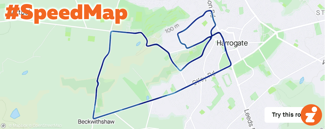
- #PaceMap or #SpeedMap: Higher speed/lower pace will be a darker blue.
- #HeartrateMap: Higher heart rate will be a darker red.
- #Elevationmap: Lower absolute elevation will be black and higher elevation will be yellow.
- #GradientMap: Descents will be yellow and inclines will be red.
- #PowerMap: Higher power will be darker purple.
- #TimeMap: Longer elapsed time will be a darker red
- #TemperatureMap: Higher temperatures will be a darker red.
To activate a #statmap for one of your activities, simply add the hashtag to that activity’s title or description.
Subscribers Only
Only Strava subscribers can add #statmaps to their activities but all athletes will be able to see them in their feed.
Viewing #StatMaps
For whatever reason, #statmaps are only rendered in your feed – they don’t show up on your activity’s detail page. So they can’t be zoomed or panned – what you see is what you get.
Here’s a quick animation showing what how each #statmap appears for a recent Yorkshire race:
Bugs & Niggles
This is only Strava’s first public iteration of #statmaps, so hopefully they’ll roll out improvements soon. Here are some suggestions:
- #Elevationmap: Strava says “Lower absolute elevation will be black and higher elevation will be yellow”, but I found the exact opposite! (See animation above.)
- #GradientMap (#GradeMap also works): this is a weird one. If you look at the animation above, I raced Yorkshire’s Royal Pump Room 8 route which covers all the roads you see in both directions. It’s as if the gradient map is preferentially-coloring the uphills – so even though the last time around I may have descended a particular section, it’s colored red because I climbed it earlier in the activity. Maybe that actually makes more sense than just coloring what happened the last time over the road, but it’s weird to see.
- #PowerMap: there needs to be more variation between colors. Even on my Sprintapalooza ride, which is essentially a zone 2 spin followed by a short sprint every lap, the color doesn’t vary much. Why not color by power zones?
- Let us see #statmaps for particular segment efforts. Right now the #statmap covers your entire activity, which makes it not terribly useful if you’re looking at a multi-lap effort such as a Crit City race, where you’ll only see your final lap. What if you could select a particular segment, and see your #statmap for that single segment effort?
- Expanding on the segment idea – why not let us see gradient maps for segments, similar to what Veloviewer does so well.
- Give us a legend or more detail about how each #statmap works
- Make #statmaps settings apply to the map on the activity’s detail page as well, so it can be zoomed and panned
Your Thoughts
Is this feature useful for you, and if so, how? Share below!
