

Yesterday Zwift rolled out an upgrade to the power metrics displayed in Zwifter’s personal online profiles: a historical power graph showing your best Zwift power numbers!
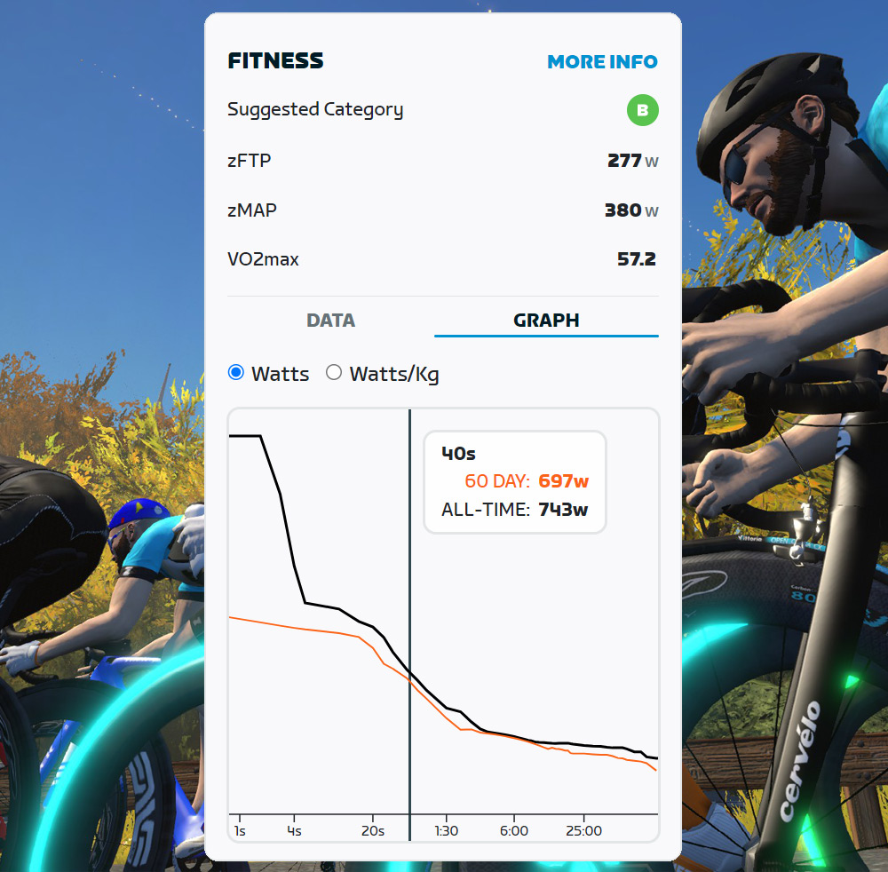
The new graph is part of the fitness metrics Zwift rolled out in December 2022, which display key power metrics used in race Category Enforcement. This graph isn’t really related to category enforcement, but it does give you a nice view of your current fitness compared to historical bests. Just click “Graph” in the Fitness box of your activity feed (zwift.com/feed) to see it:
What Is a Power Graph?
For those unfamiliar with power graphs, what this shows is your highest average wattage for a particular time interval. Just mouse over the chart and you’ll see (like my example above), the best average power you’ve done over a 40-second timespan in any Zwift activity. The graph shows your best number all-time, as well as your best number in the last 60 days.
Of course, these numbers only include data from Zwift. They don’t include your outdoor rides! (You’ll need something like Strava or Intervals.icu to get data like that.) In the example above, my best 40-second average power of all time is 743W, while my best 40 seconds in the past 60 days is 697W.
Using Your Power Graph
Power graphs, aka “power curves”, are both informational and motivational:
- Informational: look at your graph at any point to see how your current numbers stack up to your historical performances. You may, for example, see that your endurance power (60+ minutes) has increased as you’ve conquered longer and longer rides. At the same time, you may note that all the endurance training has blunted your sprinting power!
- Motivational: after an especially hard effort, you can check your power curve to see if it was “upgraded” by today’s effort. That all-out attack up the Volcano KOM may earn you a “bump” at the 8-minute mark, and everyone loves a power curve bump!
Improvement Ideas
I wouldn’t be a respectable Zwifter if I didn’t have at least 5 ideas for things Zwift could do to improve this new feature. Here are 8:
- Give me a clickable link when I mouse over the graph, so I can click to see the Zwift activity where I set a particular PR. (Strava does this nicely – click on the graph to lock in the particular time interval, then you can mouse up to click the activity link.)
- Give me Y-axis increment labels, so I can see my power numbers at a glance without needing to mouse over.
- Congratulate me! If I get a “power curve upgrade,” email me to let me know. Include a quick link to that graph in the email.
- Let me set other time increments for the graph so I can compare, for example, last year to this year.
- Let me easily share my power graph (or even better, my entire fitness “box”) – perhaps a toggle to make the info publicly visible or a way to embed it elsewhere or export it as a graphic.
- Give my fitness metrics a unique URL and their own dedicated page, which I can share with others if desired.
- Show the power curve on our activity detail pages on zwift.com, so I can see how that particular ride matches up to my best power numbers.
- Make this (and my other fitness metrics) available in the Companion app.
Questions or Comments?
What do you think of the new power graph? Post below!


Like the feature but wish there was some way I could delete older data that is from a trainer that overestimated power (Elite Qubo Smart). All of my power PRs on my zwift graph are way too high.
What does “all time” mean in this graph?
For example, does it mean “Since December 2022” when they rolled out their fitness metrics feature?
(I suspect so, since it claims I’ve made my “all time PR” for the whole 25–50s range within the last 60 days – while I know I did 50W more last summer.)
This is not “all time”, if you think about it, I have all the badges from many years ago already and you have to hit peak power of 1200-1300+ whatever it is watts, but my 1 sec high is 1200 or something. So no way this is all time. Has to be from the roll out.
yeah, mine and I bet millions of others have the exact same 2,000 watt 3 second power…
Yep! It drives me nuts haha
Yep. Been complaining to Zwift about it in game too since they now pull that data from their servers rather than a local file. My figures are s messed up
Yep, definitely have some rogue data. I’m showing a 1min power of 813W. Really hope the all-time never gets included in category allocations.
Nice and about time! Been on strava for a while.
Since i found out about fitness metricss i wanted to have them available in companion app.
So improvment number 8, yes please! Would be very convenient.
100% agree with your suggestions, especially number 4 – that would be most useful in my mind, to show progression over time
What would also be good is an FTP history