

Observant Zwifters will notice that today’s Zwift update changed the look of Zwift’s HUD and other textual elements. A fresh font has arrived! Reviews are positive, at least from one Zwifter we spotted while taking screenshots this morning:
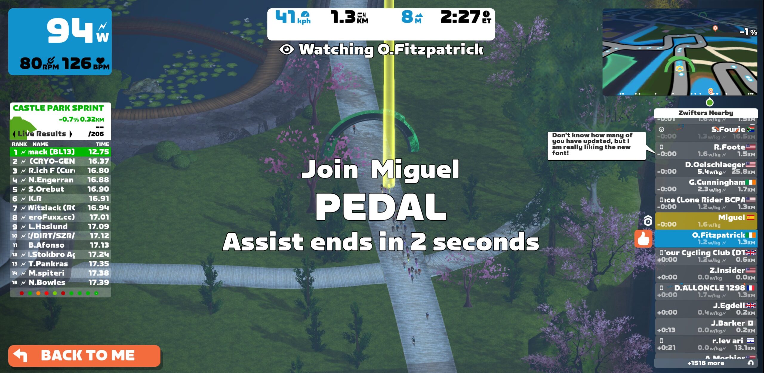
The new font is softer than the previous one, and it’s now being used across the game.
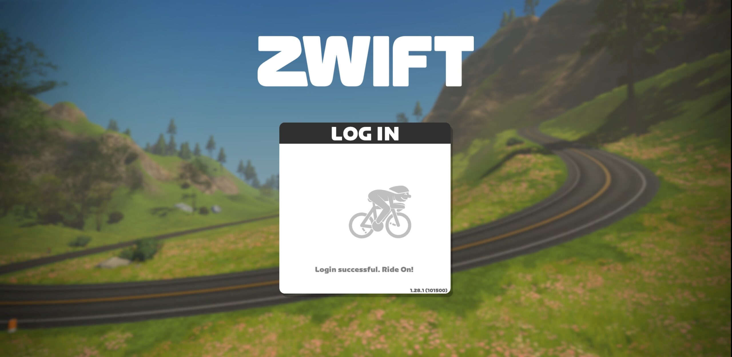
New Logo
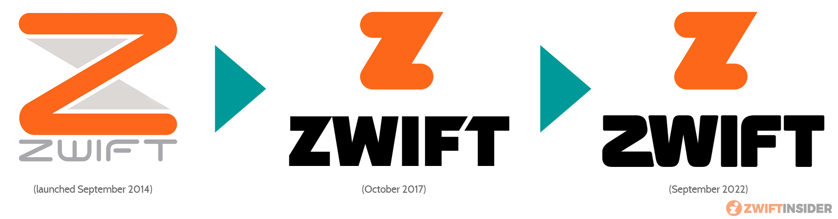
Notably, the new font is used in Zwift’s revamped logo, also unveiled today.
Evolution of Zwift logos:
Your Thoughts
We predict this font change won’t generate nearly the discussion we saw when Zwift left the “Skinny Z” logo behind years ago. But what do you think?

More importantly – have they fixed the bug that auto screenshot takes a pic of the loading results screenshot instead of waiting a few seconds to capture the results of the race?
Have seen countless people on Strava and Zwift Companion with this issue
Nearly every person from my 40 man race last night had a screencap like that. Would be nice to fix something that impacts a big population of the racing segment of users.
They said it would be fixed in the next update so i’d hope so. I’ll find out later when racing
Hope so. I told them about that bug the day it rolled out. 🙂
More importantly, have they fixed the Withings bug?
Wow, I thought that was just me. I am constantly deleting those when choosing what to save.
They should just the text – go to zwiftpower.com for the real results ….
Looks shit
Sorry..looks zhit
Looks 2hit to me.
The text is fine, but I hate what it does to the numbers. Makes them much harder to read and the uneven vertical alignment drives me batty.
I noticed the change straight away and disliked it, but didn’t know why. Hopefully they might give us the option to switch back.
New font is horrible, totally horrible. maybe use it for the names on the right side column but for everything!
Another thing to wait for on Apple TV…
It’s on APE now – just seen it
Not sure I like it!
Not sure i give a damn!
Exactly!! If you can’t provide a real update for AppleTV put up a font change. Yeah!!
Oh dear… this is what we’ve been waiting for. So pleased our subscription is being put to good use… There are many things both user requested and previously announced by Zwift we need now…We didn’t need a new font…
Yeap. Considering how long and how old the list of requests for fixes and improvements is on the Zwift forums I doubt anyone was holding out for a font change?
I don’t really care about the logo. Let’s see more actionable stuff.
Honestly… it’s not improving the key points of the UI that desperately needs attention.
Reminds me of a 90s video game, but I can’t remember which one!
Hard locked my PC twice. I was thrilled.
I get the feeling they did this so that the Z looks “softer” and much less like the ones sprayed on the Russian tanks in Ukraine.
I agree. Do what they want with the letters, it’s just stupidity changing to weird numbers that are difficult to read.
Can they not consider user configuration to show average power and speed on screen – fairly basic asks!
2WIFT
That’s what it looks like to me as well — a 2!
Not a fan. Wish we had options to choose which font we want to use.
Not an option or hack to disable the font indeed. Not a pleasent reading font.
Have they fixed the bug where I appear to go so much slower than I think I am?
Thank you, Zwift! Just what I’ve been waiting for after years of not much innovation! Nailing it!
I wouldn’t have noticed the font of you hadn’t said something
I’m curious to know if this font change was developed to help readability on small screens…
The number 1 now resembles a 7 .. don’t like it !!
Yes! I thought the same thing! It was driving me batty this morning.
If you’re not first…you’re seventh!
Do you know what the name of the font is? I like it personally and find it much easier to read when I have beads of sweat rolling in to my eyes lol.
Snooping on zwift.com suggests it’s a bespoke font named “Zwift Sprint”. The font they used previously was Muller Black.
My ANT+ Connection doesn’t work no more since the update.
Anyone the same problem? Any recommendations?
A new font. Thank god they’re prioritising the important stuff.
It’s hard to imagine an uglier font. Numbers are horrible–and what’s most important to a Zwifter? I want to glance at the numbers and immediately interpret them. These numbers always force me to pause while my brain identifies or decodes them. Hundreds of times during a ride. This may seem an overreaction, but I found it so off-putting that I took the time this morning to check out RGT, Rouvy, and TrainerRoad.
I rode with the new font last night. It randomly occurred to me that the new font looks like the NASA worm logo. I may never be able to look at the new font without thinking about the NASA logo. The new font isn’t horrible, but it seems a little out of place.
Yep…I guess people that don’t actually use it make decisions. The most important thing is seeing the numbers clearly.
The best I can say about the new font is that it is bloody awful.
Not a great change, especially for the numbers.
Should of stayed with something more “standard” rather than this stylistic, opinionated font that decreases its accessibility 😫
Use it for your new logo, sure. But you don’t have to use your logo font for the entire UI… or just use it for headings 🤦♂️
I like the Zwift Insider font. Don’t change that.
Unfortunatly Elite Sterzo is no longer working because of the update
Damn yes, doesn’t work
Please Zwift, change the numbers back, the new ones are horrible!
How to change font back?
You cannot.
You can actually – https://forums.zwift.com/t/game-update-1-28-august-2022/587655/218
Don’t mind the Font but the numbers are too confusing. The number one looks like a seven, Eleven looks like Seventeen, twenty one looks like twenty-seven, and so on. Do hope they change back to normal.
Anyone expiriencing the moving shadow ahead of your avatar? And depite riding in a sunshine the avatar looks like in permanent shadow.
It looks like a late 90’s laser quest
Fantastic new stuff. Keep going zwift
Really struggling, I’m a bit dyslexic and really struggle to read the new font. Will they be adding features to make the game more accessible ?
Agreed it’s like what you get when business managers fancy themselves as designers. They get out their crayons and everyone is too scared to say anything if they want to keep their job.
The 70’s called, they want their font back. They can have it as far as I’m concerned, it sucks
Aren’t you sure it was the 10’s? The 1 and 7 look so similar.
2’s look like Z’s and corners are rounded meanwhile companion app is constantly suffering drop outs and now my phone battery is draining exceptionally fast when using it. Zwift needs to focus on fixing these bugs first the font is not important.
The font looks retro 80’s/90’s tech. Like robocop or terminator opening credits
That 1st screenshot “ride with”, wondering when that will return
It looks awful. What a waste of development time.
Nice!
Still far too cartoony and not as slick or modern as it ought to. Also, why not have option to reduce the opacity of the HUD?
Terrible font. Let’s go back to 1978 when the video game Space Invaders was released…..
Looks like a 1978 Space Invaders arcade game font. Terrible
Minecraft map is officially 6x larger than earth and its one of the most popular games of all times with hundreds of thousands of users any day constantly changing… same for call of duty or any other online game… but zwift…zwift cant handle 5,000 on 3 maps that maybe amount to 1000 linear miles…. it seems the developers of this platform are getting paid to much for too little.
New font is not good, much harder to read and 1 looks like 7! 🤦🏻♂️ Zwift should focus on more important things – like adding roads to Watopia and not solely focusing on Makuri Islands.
I have to admit, I kind of like how it makes my 111 watts look like 777 watts! 💪🏼😉
I was 77 kg’s but now I’m 11kgs – Zwiftpower please leave me alone!
Nope…new font feels like a couch potato: round and bulky, not fast at all.
And indeed the numbers are horrible to read!
the new 1993 Sci-fi font is really bad. I’ve been a graphic designer for over 16 years and recently completed a project for a local disability charity and this new logo font which has been used everywhere (that’s a no-no in branding to start with) is not accessible to all ad would be accepted by them, yet a huge company like Zwift can use it? The Kerning (spacing between letters) is very bad. I honestly thought it was a bug to start with and my mac hadn’t loaded the font correctly. Leave it as is for the updated logo but let’s hope they can change it back for the UI font OR just release the long-awaited UI overhaul.
I’d say that the use of the new font ‘throughout’ was a mistake. It looks decent enough in some areas, but with it not being a “Fixed Width” font it means that anything showing lists of numbers is much harder to read at a glance while you’re riding since the numbers aren’t fully lined up with each other
I think Zwift needs to focus more on bug eradication instead of changing fonts.