As Zwift’s new home screen UI rolls out to more and more Zwifters, some Zwifters have complained along the lines of “The text is too small” or “Everything is too big”.
We don’t envy Zwift’s UI/UX design team and their task of creating interfaces that work well for everything from an iPhone to a big-screen TV.
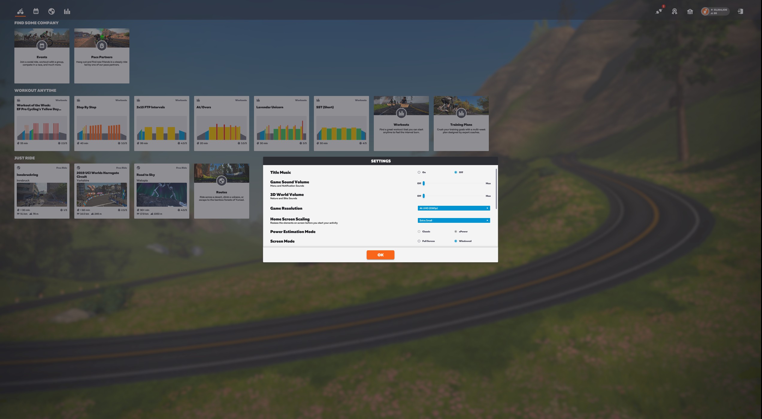
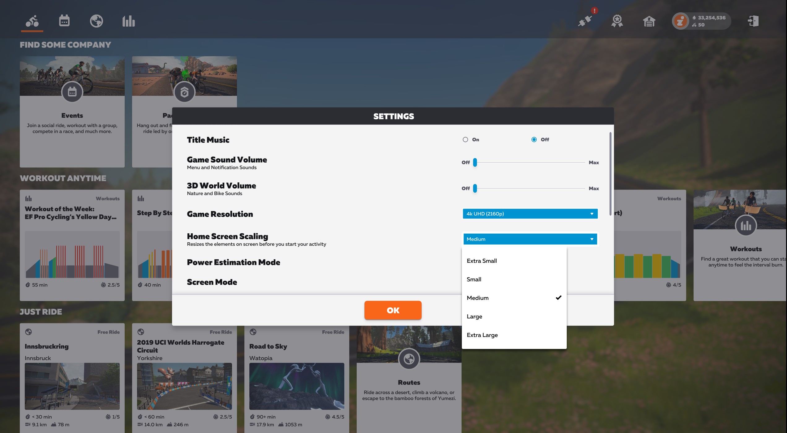
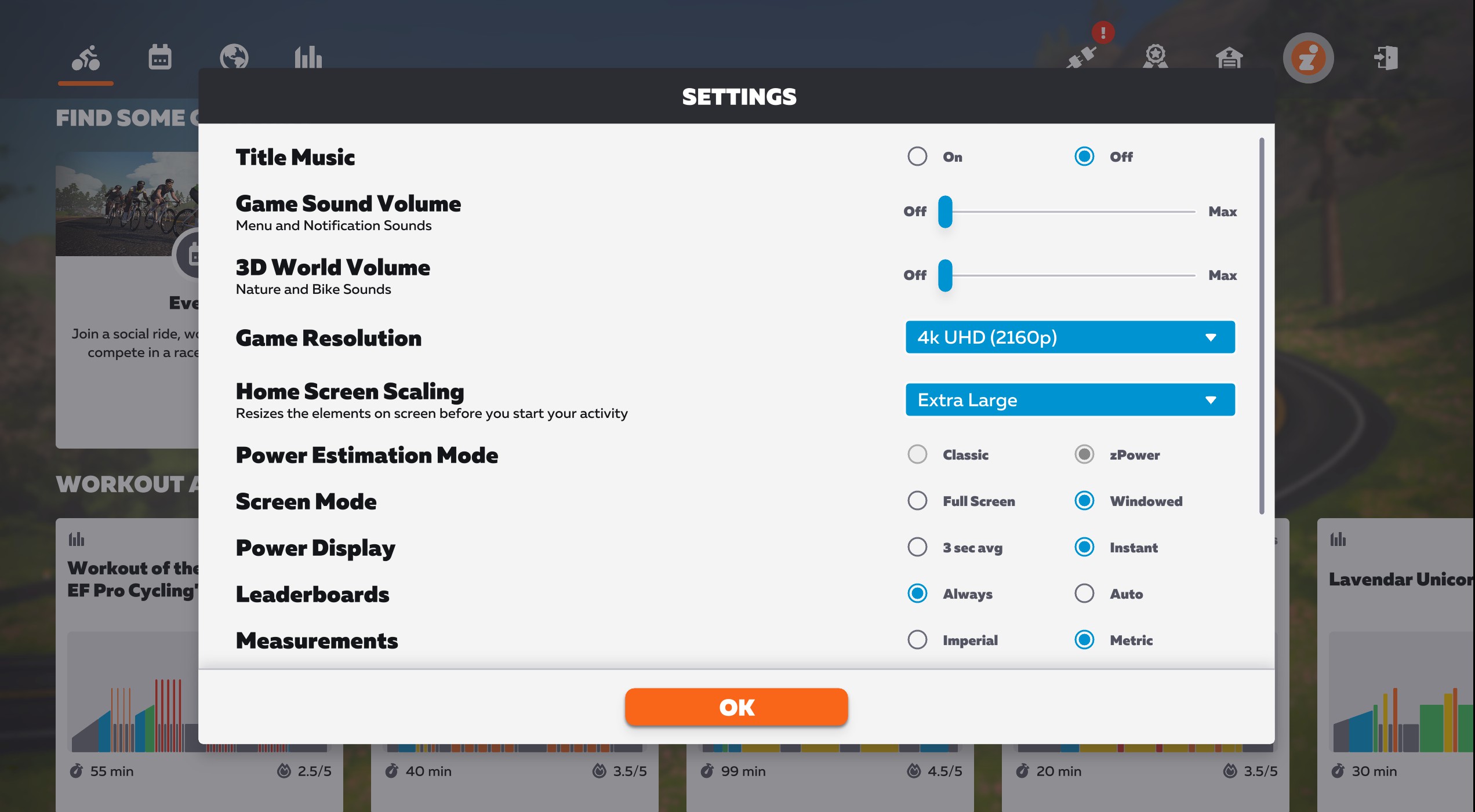
If you don’t like the sizing of elements on your new home screen, you’ll want to get acquainted with a recent addition to the new UI available under the main settings menu. Called “Home Screen Scaling”, it does exactly what it says. Here’s a quick video showing how it works:
There are currently five options available for Home Screen Scaling:
- Extra Small
- Small
- Medium
- Large
- Extra Large
Here are a few screenshots showing how the layout flexes on our test setup at the Extra Small, Medium, and Extra Large settings:
Questions or Comments?
Share below!
It seems this new UI is only for PC users?
Or will it eventually be rolled out to Tablet and mobile users?
Thanks
It’s out for PC and Mac now, for all users (I think). Rolling out to AppleTV soon, then iOS/Android.
Thanks Eric. I run via an iPad connected to a TV. I shall continue to wait patiently.
Not yet for PC for everyone as of 5/20. Hopefully soon!
or do you mean “zoon”?? LOL
I got excited for a moment thinking that we could scale the on-screen display while riding. I guess I’m just dreaming too big….
After SIX MONTHS of having first released the new UI, why don’t they put some effort into getting it on Apple TV before spending time these bells and whistles!!! (Argh!!! #@%^*)
I must say that I don’t love this new UI. The card options? kinda like a web news-type card. I thought the older version is a lot simpler and takes you to the route you want with one click. No need to click on the name, just page through and it gives you the route visual on the right-hand side. So you have an idea of what the route looks like before you make your choice. Now it takes too many clicks just to get to the route. First, need to click on the globe if you want to get… Read more »
I was of a similar mindset, but have recently discovered that the up/down, left/right and OK (or Enter) keys on a keyboard reduce the need for sweaty finger swiping on a touchscreen or touchpad.