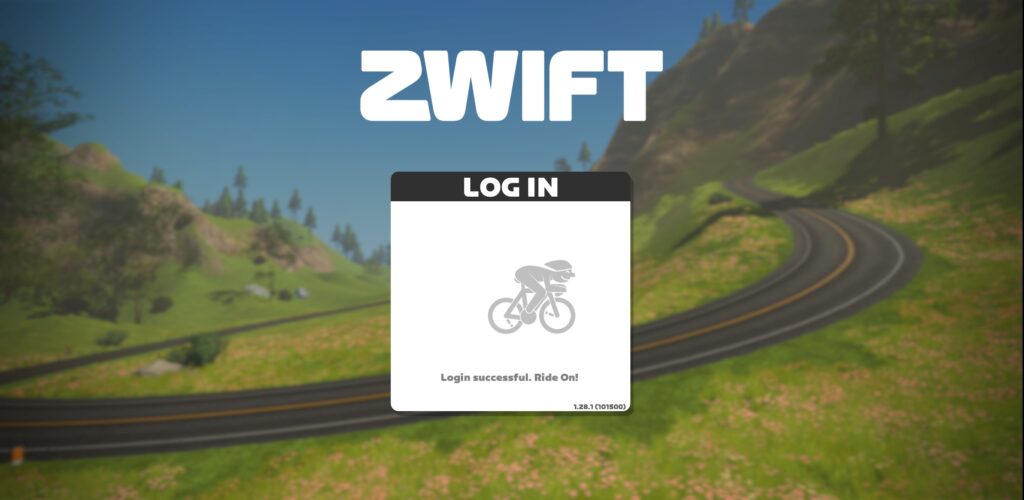
Observant Zwifters will notice that today’s Zwift update changed the look of Zwift’s HUD and other textual elements. A fresh font has arrived! Reviews are positive, at least from one Zwifter we spotted while taking screenshots this morning:

The new font is softer than the previous one, and it’s now being used across the game.

New Logo
Notably, the new font is used in Zwift’s revamped logo, also unveiled today.
Evolution of Zwift logos:

Your Thoughts
We predict this font change won’t generate nearly the discussion we saw when Zwift left the “Skinny Z” logo behind years ago. But what do you think?