Lukas Bischoff, a Zwifter from Aachen, Germany, has posted a redesign concept for the game we all know and love.
Lukas says:
As a Zwift user, I’ve always wanted a more trendy and clean interface to come up. In this redesign I tried to modify some minor things to provide a more delightful experience to the users. Here’s my proposition.
Like Lukas’ concept? Give it an upvote on the Zwift support forum. Here are my thoughts on his fine work…
Login and Icons
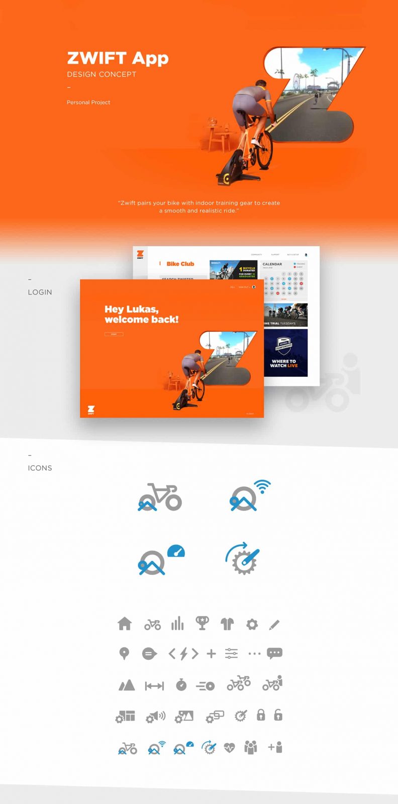
The login is straightforward enough, but redesigned to match Zwift’s current branding. The icon set is nice and clean.
Club, Courses, and Data
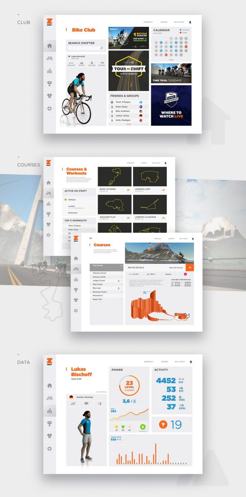
First, notice the useful navigation bar on the left which lets you easily switch between key app screens. This “get anywhere from anywhere” layout is distinctly different (and in my opinion, vastly improved) from Zwift’s current “step by step” approach to game experience.
The Club screen is the app’s “homescreen.” This is one place where Zwift could vastly improve their user experience today. Use this page to inform the user about news and events, and let them easily find friends! Lukas has added a friend search feature which is much-needed in the Zwift app, and he has also envisioned a “groups” feature which, while currently non-existent in Zwift, will certainly be built eventually to make it easy to build groups and interact with teammates.
The Courses & Workouts screen lets the user chose their world, then view the courses for that world. Obviously we don’t currently have the much-requested ability to easily ride in any Zwift world, but we know it’s coming soon. Clicking a course brings up its details, including elevation profiles, number of riders on that course, and your PRs.
Our Data screen presents our key rider info in a clean and useful format. I particularly like the new features Lukas has imagined of a leader jersey counter and automatic race categorization.
Badges, Equipment and Settings
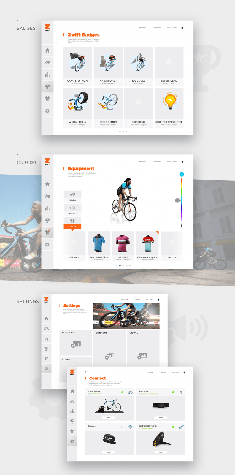
The badges and equipment pages are nicely designed, but I especially like the improved Settings interface which breaks settings into different categories: Interface, Audio, Connect, and Visual. Lukas doesn’t include screens for each of these four categories, but his one screen for “Connect” shows a nicely polished interface which should help newer users get set up more intuitively.
In Game
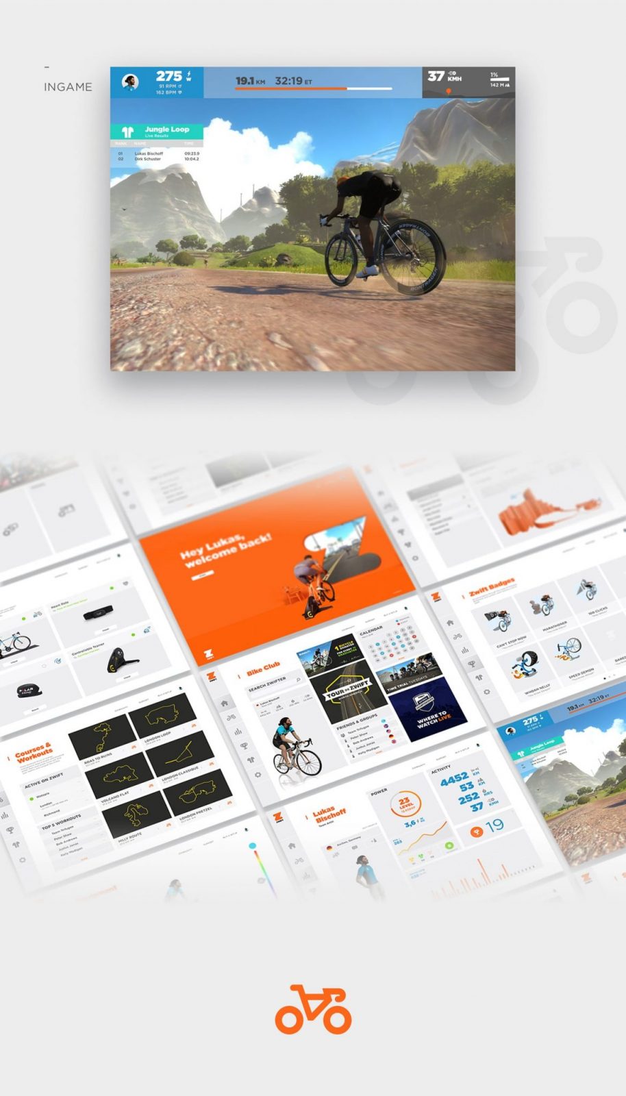
Lastly, Lukas gives a shot of what he envisions the in-game screen to look like. Since his settings options (above) include “Interface” options, I assume Lukas would like to see the ability to turn certain in-game dashboards on and off. I think this is a great idea–let riders have a very clean screen if they want, or a more crowded one. I think this would be an excellent upgrade to the in-game experience.
Overall, I would say I’m quite impressed with Lukas’ work. What do you all think?


