• Get Started
    • Get Started on Zwift
    • Zwift Course Maps
    • How to Race on Zwift (Setup, Strategy, and More)
    • Links Every Zwifter Must Have
    • More “Get Started” Posts
  • Tips & Tricks
    • Kit Unlock Codes
    • Training & Nutrition
    • Racing
    • Zwift Hacks
  • Reference
    • How Zwift Works
    • Course Calendar
    • Smart Trainer Index
      • Top Wheel-On Trainers
      • Top Direct-Drive <$900
      • Top Direct-Drive >$900
      • Exhaustive Trainer List
    • Achievements & Unlocks
    • Frames & Wheels
    • Routes & Maps
      • Master List of Routes
      • Downloadable Watopia Map
      • Rebel Routes
    • Speed Tests
  • News
    • Events
    • Game Updates
  • Shop
Search
Logo
Logo
  • Get Started
    • Get Started on Zwift
    • Zwift Course Maps
    • How to Race on Zwift (Setup, Strategy, and More)
    • Links Every Zwifter Must Have
    • More “Get Started” Posts
  • Tips & Tricks
    • Kit Unlock Codes
    • Training & Nutrition
    • Racing
    • Zwift Hacks
  • Reference
    • How Zwift Works
    • Course Calendar
    • Smart Trainer Index
      • Top Wheel-On Trainers
      • Top Direct-Drive <$900
      • Top Direct-Drive >$900
      • Exhaustive Trainer List
    • Achievements & Unlocks
    • Frames & Wheels
    • Routes & Maps
      • Master List of Routes
      • Downloadable Watopia Map
      • Rebel Routes
    • Speed Tests
  • News
    • Events
    • Game Updates
  • Shop
More
    Sign in
    Welcome! Log into your account
    Forgot your password? Get help
    Privacy Policy
    Password recovery
    Recover your password
    A password will be e-mailed to you.
    ReferenceHow Zwift WorksNews

    Sneak Peek: Zwift’s Updated Homescreen

    Eric Schlange
    By Eric Schlange
    October 20, 2021
    25

    Zwift’s design team has been hard at work creating an updated UI, and at a recent media event they shared details of the redesigned homescreen. Here’s a peek at what Zwift will be releasing in the coming months…

    Design Goals

    The homescreen redesign has been a long time coming, but the influx of new users (thanks, Covid) coupled with a company-wide refocus on core experience has helped Zwift prioritize key deliverables for this redesign, namely:

    • Make content (especially social events) more accessible: instead of events residing in a small corner of the screen, make them front and center. This will reduce the time it takes to find and start an activity, as well as surfacing more social activities for Zwifters to try.
    • Easier to use: the improved layouts are more intuitive and powerful with consistent navigation elements at the top, better filtering tools, and more. The new layouts will also play nicely with controllers used across various platforms (looking at you, Apple TV!)

    Activities Screen

    The initial homescreen view brings up a list of upcoming events, as well as several “Just Ride” options for anyone who doesn’t want to join a group event.

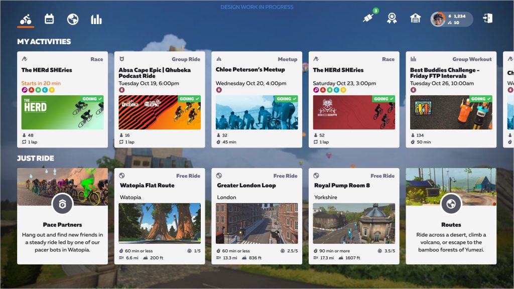
    I’m not sure how the “My Activities” and “Just Ride” options are selected for display, but Zwift definitely has the opportunity here to surface content in an intelligent way that really appeals to a particular Zwifter. For example:

    • “My Activities” should show any event or meetup you’re currently signed up for (of course)
    • “My Actitivities” could also show weekly events you’ve taken part in before, making it easy for Zwifters to build a habit and get to know others by consistently riding together.
    • “Just Ride” could suggest routes on today’s scheduled worlds where the rider hasn’t yet earned the route badge
    • If a rider consistently chooses a particular free ride route, show that as a “Just Ride” option to make it easy

    Upcoming Events

    The new homescreen’s events browser is receiving a big upgrade, giving Zwifters the ability to browse events in game with similar tools as the Companion app. That includes filtering events by type, group, and more. Clicking on an event brings up a full detail view where you can read the description and select a group to sign up.

    • Browsing events
    • Event detail view

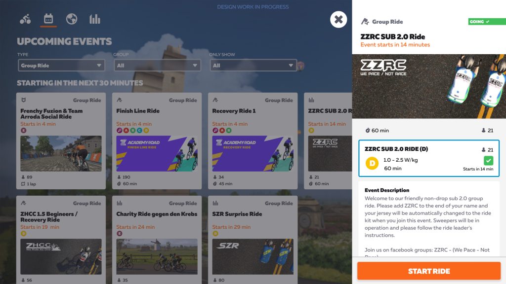
    Note: all of the screenshots supplied by Zwift indicate “Design work in progress”, so these layouts have not yet been finalized. That said, I would like to see some indication of which route an event is being held on so we know what we’re signing up to ride!
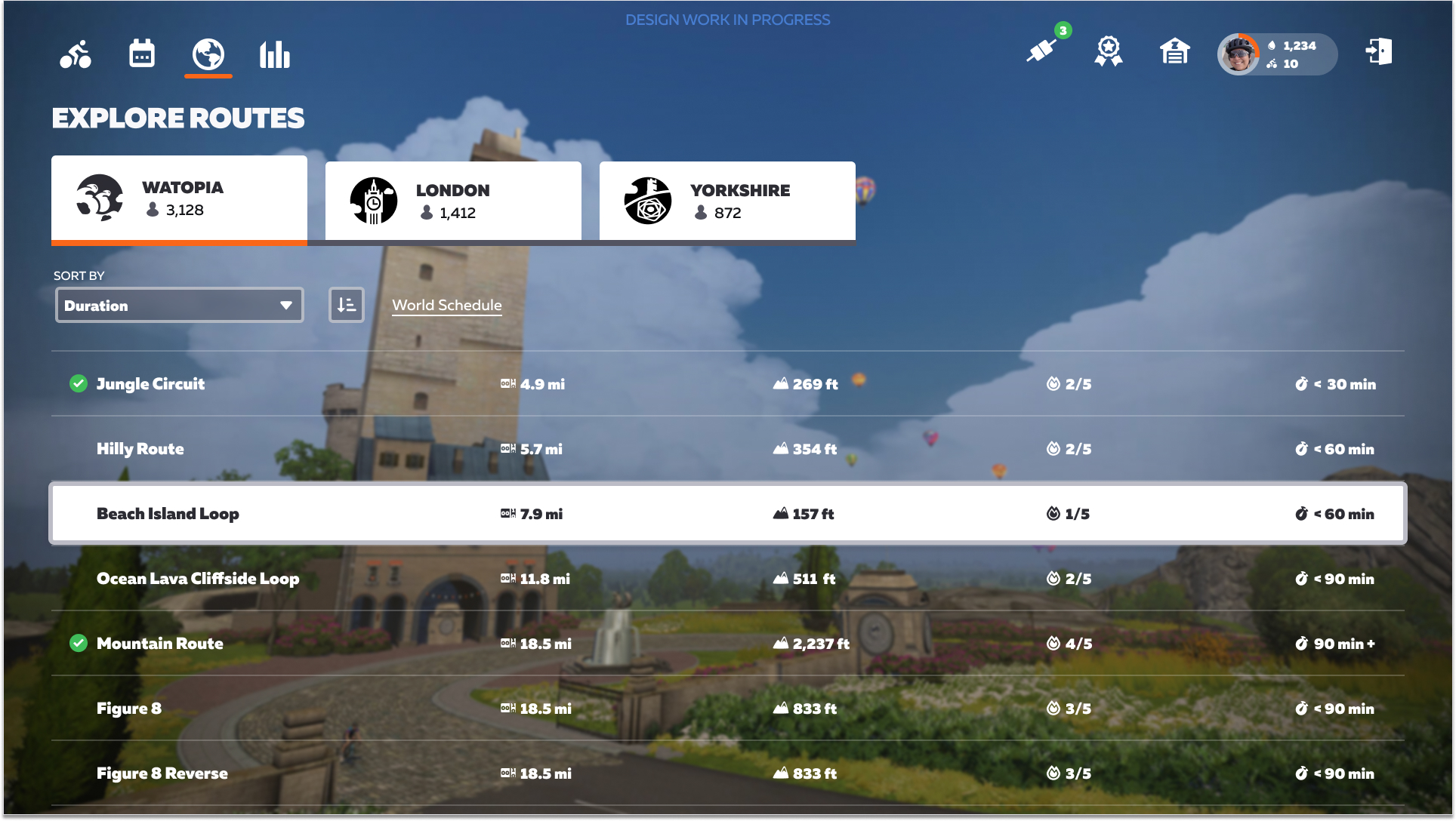
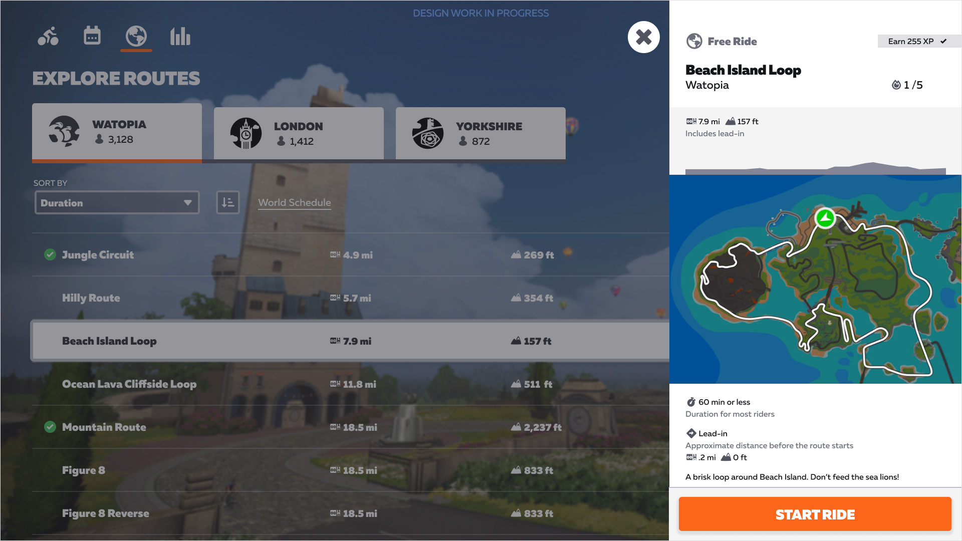
    Routes Browser

    The updated routes browser is accessible from an icon at the top-left. Some of the information available here is already available in the current routes browser, but it’s getting a helpful redesign plus the addition of:

    • A difficulty ranking (1-5 scale)
    • A time estimate in minutes (based on data showing 85% of Zwifters can complete it in X minutes)
    • The amount of XP you’ll earn if it’s your first time completing the route
    • More sorting options including Duration, Name, Effort, Distance, Elevation, and Route Completion
    • Browsing routes
    • Route details

    What I Like About It

    There’s a lot to love in Zwift’s planned homescreen redesign. Here are five things that stick out to me:

    1. Focus on events: every avatar in Zwift has a real person behind it, and events are where we can best connect with others and benefit from the encouragement and comraderie which ensues. In-game interaction is Zwift’s special sauce, and this redesign puts events front and center, where they should have been all along.
    2. Garage + Drop Shop access: we can easily access our Garage (and the Drop Shop) from an icon at the top-right. This is a common request from Zwifters who (for example) want to switch their bike frame/wheels before starting their ride.
    3. Event details: far to many Zwifters join events from the current homescreen and thus never see the event duration or full description. This redesign makes that information obvious.
    4. Route details: giving routes a difficulty rating as well as a time estimate should prove very helpful, especially to newer riders who can’t look at distance+elevation and decide if that route is suitable on a given day.
    5. Looking good: to my eyes, the new design is cleaner, more modern, and more intuitive than the current homescreen. It will be a welcome upgrade that will drive the redesign of the rest of the game’s UI.

    Not a Full UI Redesign

    It’s important to note that this is a homescreen redesign, not a full redesign of the entire Zwift game UI. Other screens such as the Drop Shop/Garage, Pairing Screen, and in-game main menu will not be redesigned in this initial rollout. But certainly, the new homescreen is a key first step that will inspire and drive further UI improvements down the road.

    Release Date

    Zwift says a phased rollout is planned to begin in December 2021 and finish in early 2022.

    Your Thoughts

    Share below!

    Related Posts

    Facebook
    Twitter
    Pinterest
    ReddIt
      Eric Schlange
      Eric Schlangehttp://www.zwiftinsider.com
      Eric runs Zwift Insider in his spare time when he isn't on the bike or managing various business interests. He lives in Northern California with his beautiful wife, two kids and dog. Follow on Strava

      25 COMMENTS

      Subscribe
      Log in using
      Notify of
      guest

      Log in using
      guest

      25 Comments
      oldest
      newest most voted
      Inline Feedbacks
      View all comments
      rdcyclist (Mark Crane)
      rdcyclist (Mark Crane)(@rdcyclist)
      9 months ago

      Well that’s great! Thanks for the update on this Eric. This kind of content is why I keep coming back to Zi!

      Hopefully they’re going to bring the entire UI into the 2020’s after this. And…

      5
      Reply
      Jim
      Jim
      9 months ago

      Really useful stuff, thanks for the heads up Eric!

      1
      Reply
      Linda Messinger
      Linda Messinger
      9 months ago

      This is good news!

      1
      Reply
      Paul Himes
      Paul Himes
      9 months ago

      Being able to access the drop shop/garage, pairing screen, and menu from the homepage will be huge improvements. Generally, I’ve chosen my events in advance, so having that take up a lot of real estate on top isn’t all that useful to me, but I can see how some people would find that helpful. I like that it looks like there is a dedicated Pace Partners button (does this mean that they’d no longer be futureworks?). I get annoyed that I first have to move the suggested world to Watopia on the homepage before they’ll show up currently. I don’t… Read more »

      4
      Reply
      Kristian
      Kristian
      9 months ago

      It would be nice if you could set up sessions from here. Like start with Pace Partner D for first ~10 minutes, and then move to Pace Partner C or B after a warm up and have it smoothly transition like it does for other upcoming events. I hate having to stop riding, click finish ride, and start over again to move to faster Pace Partner after warming up.

      10
      Reply
      C.L.F.
      C.L.F.
      9 months ago
      Reply to  Kristian

      I’ve thought about this problem, too. Another solution would be a longer and in some kind adaptive pedal assist. For example limited to a certain maximum time like maybe 10 min (or longer, combined with a drop penalty to make it fair), assisting you with a certain % of the pace partner’s power as a starting point which could be adapted by a bias setting as used in trainings. This way you could also save your whole pace partner ride in one activity.

      1
      Reply
      Kristian
      Kristian
      9 months ago
      Reply to  C.L.F.

      That idea would work too, I’d even be okay with missing out of the drops or just the bonus until the assist ended. I hate having to stop my workout that much, but I do like that I can get in some good SST with other people using the Pace Partners. Even a maximum of 15 minutes of the assist would be plenty.

      1
      Reply
      C.L.F.
      C.L.F.
      9 months ago

      Looks very promising! 😀 Will we be able to join pens directly from there or will we still have to start a ride and wait (and sometimes hope) for the pop-up to come up? For me, that would be the next big step after being able to go back to the home screen when ending a ride. Or is this feature even implemented already and I have missed it all the time?!

      3
      Reply
      Charles Rogers
      Charles Rogers
      9 months ago

      No mention of access to workouts, and nothing obvious on the images. Anything to say about these?

      0
      Reply
      Paul Rayner
      Paul Rayner(@paulrayner)
      9 months ago
      Reply to  Charles Rogers

      I’d guess workouts would be under the “bar graph” icon next to the world icon on the left. It’s incredibly difficult to design icons which will be obvious to everyone, so it’s natural that we’d explore and find these things.

      Overall, these changes look good to me. It’s great to see Zwift making changes which look well thought out and which they’re showing to key people like Eric in advance so they can get key feedback if needed.

      0
      Reply
      Sherman Olsen
      Sherman Olsen
      9 months ago
      Reply to  Charles Rogers

      The workout interface is the worst part of the current UI, certainly on Apple TV at least. It’s not accessible through Companion, either. It must be getting filters, right? Headers like “Academy 2019” tell me nothing about what is in the folder. And Favorites? And maybe being able to hide workouts I’m never going to do? If Fulgaz had a more diverse workout library I may have already taken a break from paying for Zwift.

      0
      Reply
      Eric Schlange
      Author
      Top Member
      Eric Schlange(@eschlange)
      9 months ago
      Reply to  Charles Rogers

      Zwift didn’t show us any previews, unfortunately. I sure hope it’s getting refreshed on some level, though!

      0
      Reply
      Stuart Lynne
      Stuart Lynne(@sl)
      9 months ago

      Looks like a useful upgrade. Would prefer *actual* game UI changes.

      I expect that this will be useful for new users though.

      0
      Reply
      ArT
      ArT
      9 months ago

      I cannot see the map of the route. Only after clicking. Poorly prefer the current menu.

      0
      Reply
      Gil_SantaMaria
      Gil_SantaMaria
      9 months ago

      Thanks for the update….I just hope that these changes will allow Zwift to continue to work on older operating systems, especially on old Macs

      0
      Reply
      abaelard
      abaelard
      9 months ago

      What i see is a lot of whitespace and useless pictures instead of compact lists – just like on the website today. I’d like to have a simple calendar to find my event next monday without scrolling for three days, or a large detail view for an event without the need to check zwiftpower to find out on which route a group ride will take place. I’m propably too old for this.

      5
      Reply
      Alex
      Alex
      9 months ago

      Looks pretty decent but why would they release a new UI that’s clearly not optimized for mobile devices and Apple TV?

      If you claim the reason behind your hardware push is to ease the onboarding process, why would you design a UI that looks like it’s made for desktops instead of tablets/phones and the Apple TV remote?

      I’m not suggesting they should just copy the Peloton UI but at least take a look at what’s clearly working in the real world and gets good reviews from actual UX designers.

      1
      Reply
      Jwiffle
      Jwiffle
      8 months ago

      Need to be able to search those riding to find friends so you can click ride with. Currently, you have to scroll, and half the time they don’t even show up even though I know they’re riding because I got a notification in companion and talked to them on the phone.

      0
      Reply
      FremontDZ
      FremontDZ
      7 months ago

      It’s a little strange that this is the UI/UX the team put time into changing. The UX 101 stuff – getting into the menus, the lack of an easy-to-see in-ride progress/elevation profile graph, the problem of closing the app after finishing a ride – all seem like they should take priority over the ride selection design. By this point, it’s impossible Zwift hasn’t had extensive feedback on their poor UX. Like most users, I appreciate “the hard stuff” in the code – getting the program to work with smart trainers and the accurate effort scaling. But it’s like they ran… Read more »

      0
      Reply
      John k.
      John k.
      6 months ago
      Reply to  FremontDZ

      As a UX design leader.. I would totally agree. Also, a fairly new Zwifter. There are just so many fundamental issues with the UX it’s almost impossible for a newbie. At least this improvement does allow you to configure things ‘before’ you start riding. That had to be the most ridiculous thing I thought when I first started. You can’t ‘get in’ until you ‘ride’.. made no sense at all. (And my list is actually pretty huge.. why can I only see my w/kg in the list and not in my HUD? No menu at all and sole dependence on… Read more »

      0
      Reply
      DVM
      DVM
      6 months ago

      Looks very nice but still not got the update? Any ideas when it would roll out?

      0
      Reply
      Rhys
      Rhys
      6 months ago

      Really informative update, thank you😁

      0
      Reply
      ron
      ron
      5 months ago

      Looks like they designed the ui for people who needed pictures in their books

      0
      Reply
      Fran donahue
      Fran donahue
      4 months ago

      New layout is terrible. Need a magnifying glass to read it.

      0
      Reply
      Eric Schlange
      Author
      Top Member
      Eric Schlange(@eschlange)
      4 months ago
      Reply to  Fran donahue

      You can change the size in the main settings menu.

      0
      Reply
      wpdiscuz   wpDiscuz

      Free Zwift Trial

      Create Account

      Newest Featured Posts

      All About Zwift Academy Road 2022

      Events

      Top 5 Zwift Videos: Ramp Tests, Racing, and Resources for New Zwifters

      Racing

      How the Race Was Won: Surviving Box Hill

      Racing

      Support This Site

      Contribute a post, shop through us, make a donation, advertise on this site. See how you can support Zwift Insider!

      This community-driven site is maintained by Eric Schlange and a team of Zwift enthusiasts. Zwift Insider is independent of Zwift corporate (www.zwift.com), although Zwift does provide funding to help defray site costs.

      This site contains affiliate links to Amazon, Wahoo, and other brands. Zwift Insider makes a small commission on purchases made from these links, so please shop through them to support our efforts.

      Terms of Use/DMCA Copyright Policy

      Privacy Policy

      [email protected]

      Latest articles

      7 Deadly Wins, Week 5: Playing the Hand You’re Dealt

      All About Zwift Academy Road 2022

      Top 5 Zwift Videos: Ramp Tests, Racing, and Resources for New Zwifters

      Popular Categories

      • Racing887
      • News699
      • Training & Nutrition566
      • Interviews435
      • Events399
      • Routes & Maps288
      25
      0
      Would love your thoughts, please comment.x
      ()
      x
      | Reply
      Comment Author Info
      :wpds_smile::wpds_grin::wpds_wink::wpds_mrgreen::wpds_neutral::wpds_twisted::wpds_arrow::wpds_shock::wpds_unamused::wpds_cool::wpds_evil::wpds_oops::wpds_razz::wpds_roll::wpds_cry::wpds_eek::wpds_lol::wpds_mad::wpds_sad::wpds_exclamation::wpds_question::wpds_idea::wpds_hmm::wpds_beg::wpds_whew::wpds_chuckle::wpds_silly::wpds_envy::wpds_shutmouth:
      You are going to send email to

      Move Comment


    • Related Posts