The goal is to get a better way of ranking riders for Zwift races without the need for a complete race result-based ranking system. In these two articles, a way of doing this using existing power data is being explored. The outcome will be a score for each rider, between 0 and 1000, with each 100 representing approximately 10% of the cycling population, by sex. That way race organisers can set categories to suit their target riders.
In the first article the data from a recent race series was examined to show that each of the eight power measures on Zwift Power influences the race outcome, and that simply looking at one is imperfect.
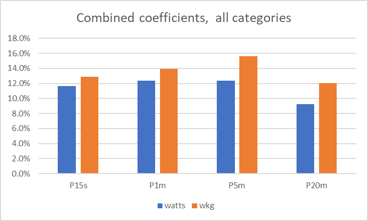
As a reminder, in that article eight measures of power were compared against race outcomes. The measures were: 15-second power, 1-minute power, 5-minute power, and 20-minute power, each in both watts and w/kg. The final conclusion was that the influence of each of the eight measures on race outcomes was something like this:

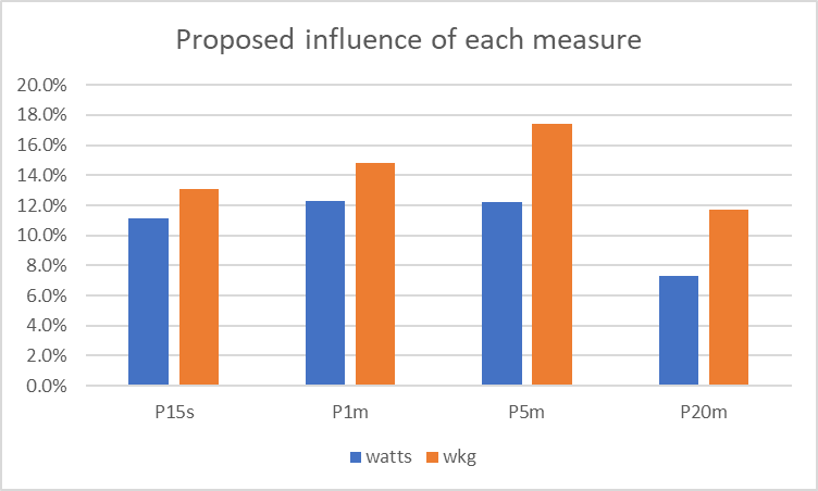
To turn this information into a rider ranking, it is logical to make an assumption that there is a link between high power in one measure and high power in another. The analysis so far has not removed this. For the sake of simplicity, we may assume that about half the “shared percentage” in the bars above is highly correlated. Removing this “shared contribution” (and re-setting the percentages so that they sum to 100%) means that the different contributions are accentuated a bit, but none is ignored, and gives this:

Turning Power Into a Rank
For any rider, for any of the power measures, that power can be turned into a rank by comparing where that power is compared to the power data for all riders. For example, if you have a 5-minute power of 4 w/kg, you are 46.5% of the way up the list of male cyclists. If each of the measures we have is turned into a position value using this approach, then each rider can be given 8 “position” measures between 0 and 100, one per power measure.
To get the final ranking, simply take each of those 8 positions and multiply them by the “percentage influence” from above, add those results up, and then multiply the total by 10. For example:
| Measure | Value | Position | Influence | Position x Influence |
| 15s watts | 621 | 41.0 | 11.1% | 4.555 |
| 1 min watts | 439 | 57.0 | 12.3% | 7.010 |
| 5 min watts | 324 | 64.1 | 12.2% | 7.850 |
| 20 min watts | 270 | 61.7 | 7.3% | 4.504 |
| 15s w/kg | 7.67 | 32.2 | 13.1% | 4.222 |
| 1 min w/kg | 5.42 | 43.5 | 14.8% | 6.435 |
| 5 min w/kg | 4.00 | 46.5 | 17.4% | 8.091 |
| 20 min w/kg | 3.26 | 41.0 | 11.7% | 4.813 |
| Total x 10: | 475 |
So that rider would be welcome, say, in a 400-600 category race.
Final Thoughts
This would provide individual riders with a much clearer sense of their ranking. Race organisers could easily construct their race categories, focussing on different groups of riders with confidence. It could also be extended to specialised classifications (eg for crit or iTT), by varying the influence values.
What do you think? Let me know in the comments below!
Postscript
There is a better way to remove the “shared influence” of the measures, rather than assuming half as above. The approach is to get all the correlations between each pair of coefficients for all the data, and then identify the least correlated pair. Then convert the correlation of that pair into a corrected “shared percentage”, and remove that rather than the 50% assumed in this article.
Postscript 2: Data Sources
The power data used in the original analysis is all available to any Zwift rider who connects with Zwift Power; it has been anonymised in the processing as can be seen. The race data for the original power analysis is from the Dirt Racing Series (who have explicitly given permission for anonymised data use for this analysis). The power to position data in the table above is my personal power to position data from intervals.icu.